Global Config & Styling System
This asset features a Global Config & Styling system to easily configure all the functionnal and visual settings of any system.
I will be refering to these systems many times across the documentation so please check out the following details to understand how they work and how to use them.
Global Config System
The Global Config Data Asset allow you to quickly change all the various settings required for the pack to work.
The default Config Data Asset used by the system (DA_EGUI_DemoGlobalConfig) can be found in the folder EasyOptionsMenu/Core/GlobalConfig
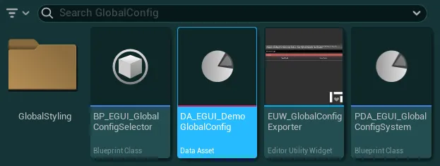
I strongly recommend you to create a new config data asset or duplicate the demo config to set up your own config, check out the following dropdowns for more details
How to create a new Config Data Asset
-
To create a new Config Data Asset, right Click anywhere inside the Content Browser window and search “Data Asset”
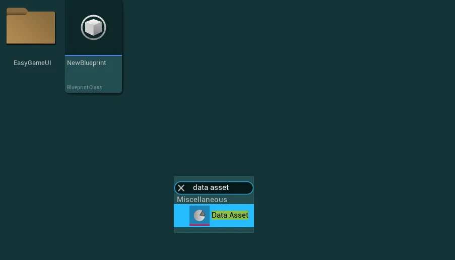
-
In the window that appeared, search for
GlobalConfigand selectPDA_EGUI_GlobalConfigSystem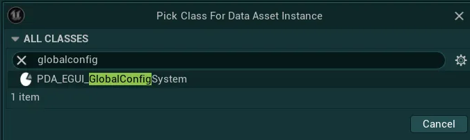
-
Give this new asset a name and you now simply have to select this data asset to be used by the system (instructions just below)
How to select the data asset used by the system
-
To change which data asset is used by the system, go into
EasyOptionsMenu/Core/GlobalConfigand open the blueprintBP_EGUI_GlobalConfigSelector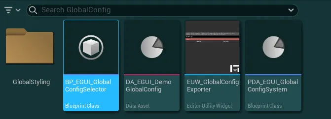
-
In this blueprint, simply change the value of the
Global Config Data Assetvariable to be your newly created data asset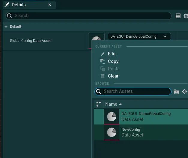
-
Your new data asset is now fully ready to be used!
How to retrieve Global Config variables in any blueprint
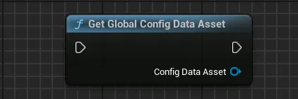
You can retrieve any variable from the Global Config using the Get Global Config Data Asset function. This will return the config data asset object used by the system and give you access to any variables.
Warning
This object is intended for Read-Only access, do not attempt to modify the variables during gameplay as it will likely lead to unexpected results.
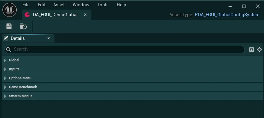
In the Config Data Asset, you can see many options to control the various aspects of the pack, they are split in several sections that I will detail just below.
Note that all settings might not be relevant as of right now since they may require additional setup, that will be described in following sections of the documentation.
Global Category
Global

-
Styling Data AssetThe global styling data asset that will be applied to all widgets
-
Disable Initialization Messages?If True, all nominal initialization messages from the asset will be disabled (errors and warnings will still be displayed)
Inputs Category
Inputs
-
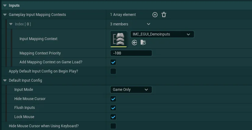
Gameplay Input Mapping ContextsAll the Input Mapping Contexts that can be active during gameplay and removed by the UI system when needed.
Optionally you can define a priority for the IMC and ifAdd Mapping Context on Game Load?is True, the system will take care of adding this specific IMC on load.In this array you should reference all IMCs that are expected to be used at some point during gameplay, even if they should not be added by default (with the boolean set to False).
-
Apply Default Input Config On Begin Play?If True, the defined Default Input Config will be applied on begin play.
-
Default Input ConfigInput config to apply by default when no widget in the system is able to provide a new input config.
Optionally, this can also be enforced at begin play if
Apply Default Input Config On Begin Play?is True
-
Hide Mouse Cursor When Using Keyboard?If True, the mouse cursor will be hidden when using the keyboard to navigate the UI system. By default, only using a Gamepad can hide the mouse cursor.
Options Menu Category
Options Menu
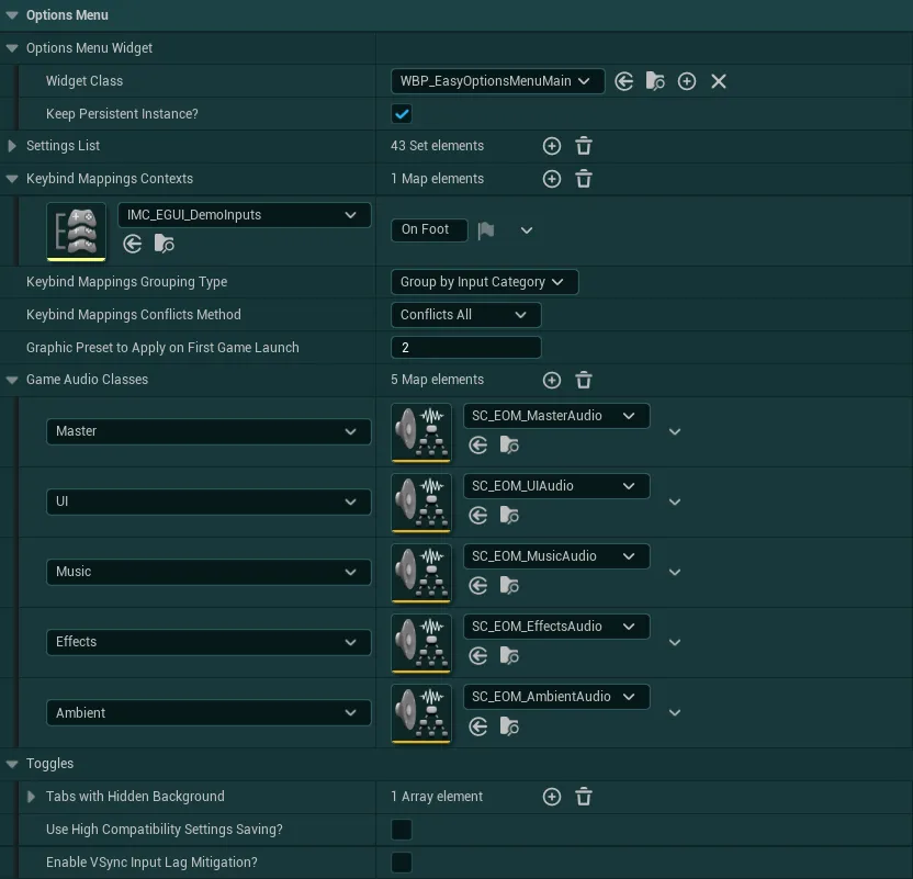
-
Options Menu WidgetWidget shown when calling the "Open Options Menu" function from the HUD (used by default as the options menu in the Pause/Main Menu)
-
Settings ListList of all settings managers that should be initialized at begin play and can be later used by the options menu or globally by any other system
-
Keybinding Mapping ContextsThis variables defines the list of all the Input Mapping Contexts that will contain any rebindable inputs and you would like to be used in the Key Rebinding system. More details on how to setup these input mapping contexts are given in the section dedicated to the Options Menu.
The text associated with each will be used as category name if grouping by Mapping Context
-
Keybinding Mappings Grouping TypeDefine how the keybindings will be groupped inside the options menu.
Group by Mapping ContextWill group all the keybinds under a category defined in the previous variableGroup by Input CategoryWill group all the keybinds by the key’sDisplay Categorydefined inside the input mapping context, regardless of its original mapping context Note that the key conflict management will only handle keys within the same mapping context, if grouping them by Input Category, this system will still work but could cause some confusions for the user
-
Keybinding Mappings Conflict MethodDefines how the keybindings conflicts should be handled by the system
Conflicts by Input Mapping ContextOnly keys within the same input mapping context will conflict (regardless of display categories)Conflicts by CategoryOnly keys within the same display categories will conflict (regardless of Input Mapping Context) - Note that based on your input setup, this could create unwanted behaviors withing IMCs, consider using "Conflicts All" if suitableConflicts AllAll keys will be considered for conflicts (regardless of category or IMC), meaning no conflict will be allowed at all across all available keymappings
-
Graphic Preset To Apply On First Game LaunchIf you wish to force a graphic preset on first game launch, set this value to anything higher than
-1-1= None/Engine Default ;0= Low ;1= Medium ;2= High ;3= UltraUsually, the engine will default to Ultra preset, changing this might be useful to ensure a good experience on all hardwares right from startup
-
Game Audio ClassesAudio classes used by the game to group different sounds. The classes defined in here will be controled by the options menu for their volume based on their respective “key” (Master, UI, Music, etc).
If you don’t have these respective audio classes you can use the classes provided by the pack listed in the demo config data asset.
More details on the setup of audio classes are given in the section dedicated to the Options Menu.
-
Toggles-
Tabs With Hidden BackgroundTabs of the options menu that should have a transparent background.
This can be useful to allow the player to see the world rendered in the background of the menu while making changes such as graphic settings changes.
-
Use High Compatibility Settings Saving?If True, settings will be saved on disk in a standard Unreal save file instead of a JSON File, at the cost of no longer being human readable.
This can be required on some platforms that do not support properly storing JSON files like consoles.
-
Enable VSync Input Lag Mitigation?When enabled, the game will try to minimize the input lag that vsync might cause by caping the framerate below the vsync threshold. Results may vary based on monitor configuration.
This input lag mitigation will only be active when the player enables VSync.
-
Game Benchmark Category
Game Benchmark
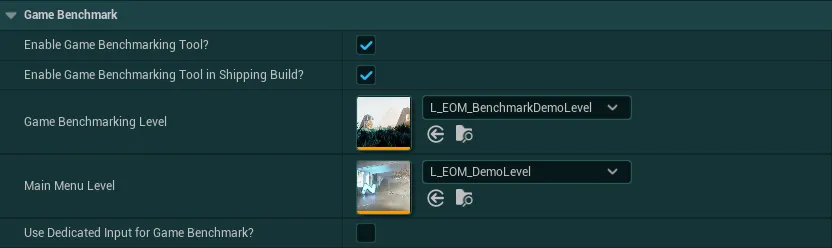
-
Enable Game Benchmarking Tool?Should the game benchmarking tool be enabled and accessible inside the options menu?
Before enabling this, make sure that you have followed the instructions inside the Options Menu section about the Game Benchmark to set it up properly
-
Enable Game Benchmarking Tool in Shipping Build?If the Game Benchmarking Tool is Enabled, should it also be enabled in Shipping Builds (for players)?
-
Game Benchmarking LevelReference of the level that contain the game benchmark setup as described in its dedicated section
-
Main Menu LevelReference of your main menu level that can be used to quit the benchmark
-
Use Dedicated Input for Game Benchmark?If False, the game benchmark button will be displayed as a setting inside the Graphics Settings tab of the options menu. If True, the game benchmark button will be displayed with its own input and standalone button in the footer of the options menu
System Menus Category
System Menus

-
Pause Menu WidgetWidget shown when calling the "Open Pause Menu" function from the HUD. This is used for demo purposes in the asset.
-
Pause Game In Pause Menu?If True, the game will be paused when entering the Pause Menu
If False, the game will be running at realtime while the Pause Menu is open
Global Styling System
The Global Styling Data Asset allow you to quickly customise many visual elements across all the widgets provided with the pack.
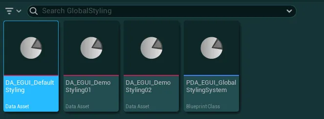
To change any of these styles, go to the EasyOptionsMenu/Core/GlobalConfig/GlobalStyling folder. In here, you will find the styling data asset used by default (DA_EGUI_DefaultStyling), as well as other presets for demonstration.
How to select the Styling Data Asset used by the system
- To select which Styling Data Asset is used by the system, open your Global Config Data Asset (or the demo one from the folder
EasyOptionsMenu/Core/GlobalConfigif you are using it) -
Then, inside the
Globalsection, simply change the data asset in theStyling Data Assetvariable
-
Recompile any blueprint for the changes to take effect
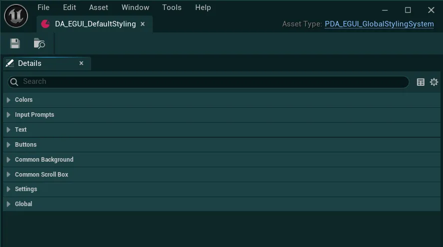
Once the Styling Data Asset opened, you will be presented with many options to control the various styling elements, they are split in several sections that I will detail just below.
Note
For the changes to be applied and visible on the widgets in editor, you may need to trigger a compilation on any widget or blueprint of the pack
Colors Category
Colors

-
Accent ColorColor used to highlight some parts of the UI such as the dividers, the buttons, the dirty indicator
Input Prompts Category
Input Prompts

-
Input Prompt Icon ColorColor applied to all the input prompts using the Input Prompts Widgets
-
Input Prompt Overlay MaterialOverlay material that can be used to stylize the input prompts
You can check out the
M_InputPrompts_DemoOverlayfor an example of overlay material
-
Input Prompt Overlay Material Parameter NameParameter name of the base texture defined inside the overlay material
Text Category
Text
-
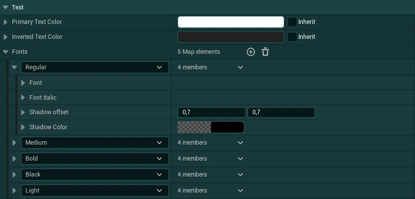
Primary Text ColorColor used by default for the Common Text (all texts inside the pack)
-
Inverted Text ColorColor used when needed against backgrounds that could use the same color as the primary text color (The buttons for instance)
The color can be inverted by using the function
Switch Text Coloron any Common Text widget
-
FontsAll the settings for fonts using 5 presets: Regular, Medium, Bold, Black and Light. For each preset, you can select a font as well as an italic variant, and control the shadow used by the font.
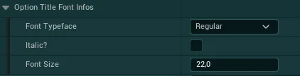
The config of all the widgets using a Common Text will have an option to control which font is used as well as its size
Buttons Category
Buttons
-
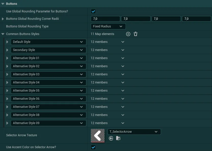
Use Global Rounding Parameter For Buttons?If True, all the button styles will be overwritten to use the global radius and rounding type values defined in the styling
If False, each button style will be entirely responsible for setting its own styling including rounding parameters
-
Buttons Globa lRounding Corner RadiiCorner Rounding applied to all buttons if the global rounding parameter is enabled
-
Buttons Global Rounding TypeRounding Type applied to all buttons if
Use Global Rounding Parameter For Buttons?is True
-
Common Button StylesList of standard buttons styles used by the Common Button widget based on which style is selected in the widget
The config of all the Common Button widgets will have an option to control which style is used by the button

-
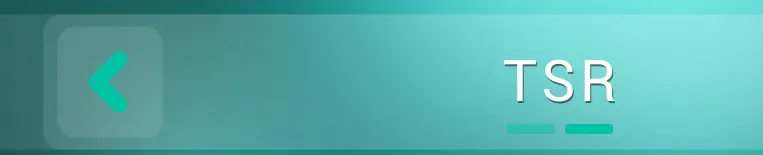
Selector Arrow TextureThe arrow image used on common selector button widgets. The texture must be squared and pointing to the left for the best results. This image can be seen on all settings selector and inside the gallery
-
Use Accent Color on Selector Arrow?If true, the selector arrow texture will use the accent color, the texture must be white for the color to apply properly. If false, the texture color will be retained
Common Background Category
Common Background
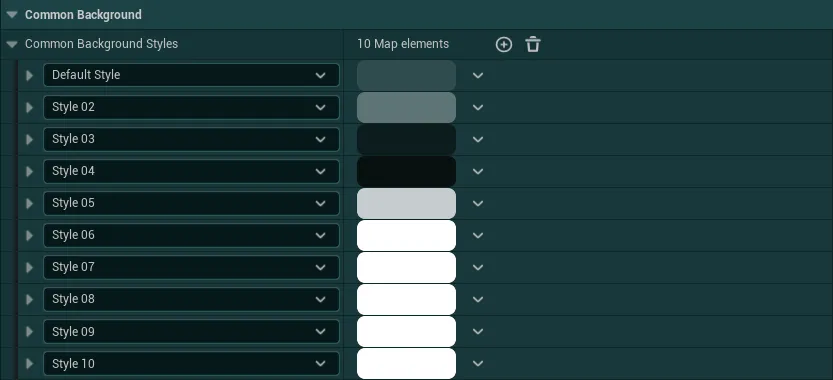
The single Common Background Styles variable contain a list of standard border styles used by the Common Background widget based on which style is selected in the widget.
The Normal Style selector is the style visible by default and Active Style Selector can be visible by calling the function Set Background Active on any Common Background widget
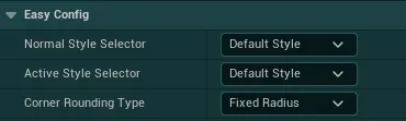
The Corner Rounding Type define which type of rounding should be used for the specific background, regardless of what is set inside the style
Common Scrollbox Category
Common Scrollbox
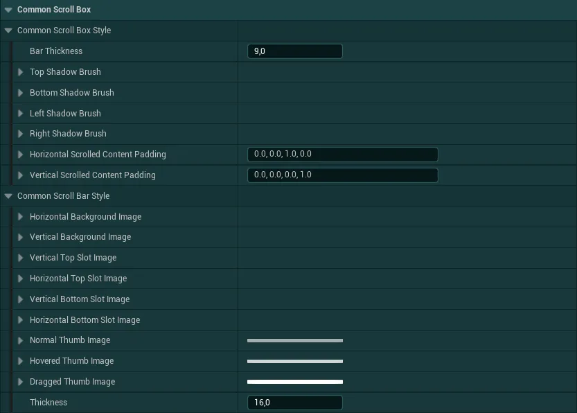
Both of these settings are used to apply a style to the Common Scroll Box widget
-
Common Scroll Box StyleStandard style definition for a Scroll Box in Unreal
-
Common Scroll Bar StyleStandard style definition for the Scroll Bar
Note: The scrollbar “thumb” (the selectable part) always uses the accent color regardless of the styling color in here
Settings Category
Settings
-
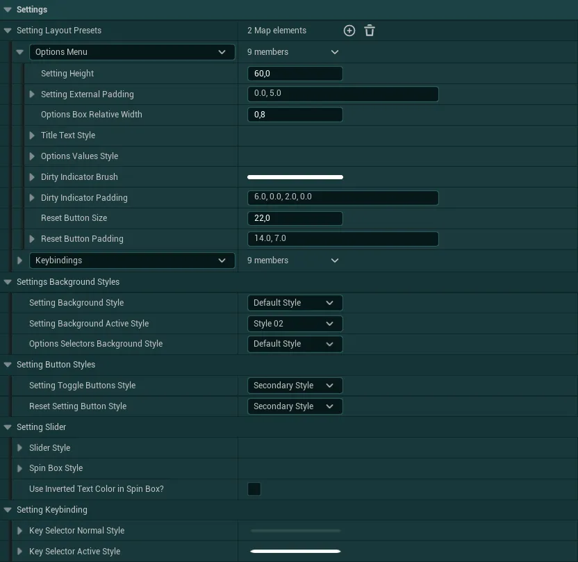
Setting Layout PresetsPresets used in different contexts to apply base styling rules to the Setting Widgets. Each preset can define various parameters like the height of the setting, the fonts used the style of the reset button, etc.
-
Settings Background StylesVarious styling options for the backgrounds used by all settings-
Setting Background StyleStyle used for the background/border of the entire setting when not in focus/hovered

-
Setting Background Active StyleStyle used for the background/border of the entire setting when in focus or hovered
-
Options Selectors Background StyleStyle used for the background/border of the setting values part

-
-
Setting Button Styles-
Setting Toggle Buttons StyleButton style that should be used by the Setting Toggle widgets buttons
-
Reset Setting Button StyleButton style that should be used by the reset button on each setting
-
-
Setting SliderRegroup various styling options for the Setting Slider widget-
Slider StyleStyling applied to the slider part of the setting
-
Settings Spin Box StyleStyle used for the spinbox (numerical input) in the widget
-
Use Inverted Text Color in Spin BoxCheck this box if the text inside the spin box should be using the inverted text color (if you want to have a light background in the spin box for example)
-
-
Setting KeybindingNormal and Active style for the key selectors inside the Setting Kebinding widget
The Active Style is used when the user is focusing one of the key selector to change the keybind
Global Category
Global
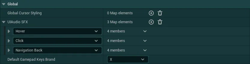
-
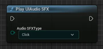
UI Audio SFXSet of SFX effects that will be played in Common Widgets of the system (mostly buttons, settings, etc.)
Those SFX can also be called from anywhere with the global function
Play UI Audio SFX
-
Global Cursor StylingSet of cursor widgets to automatically apply to different states of the mouse cursor

-
Default Gamepad Keys BrandSelect the default value between the three types of gamepad keys available. The gamepad keys brand can then be modified during gameplay inside the options menu
X= Xbox Gamepad
P= Playstation Gamepad
S= Nintendo Switch Gamepad
Config Exporter Tool
The Global Config Exporter Tool is a utility that will help you export or import any config from the pack (Global Config & Global Styling) in a text format.
How to use the Config Exporter Tool
-
You will find this tool inside the
EasyOptionsMenu/Core/GlobalConfigfolder, you can open it by right clicking and selectingRun Editor Utility Widget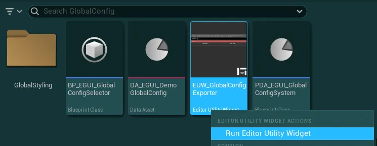
-
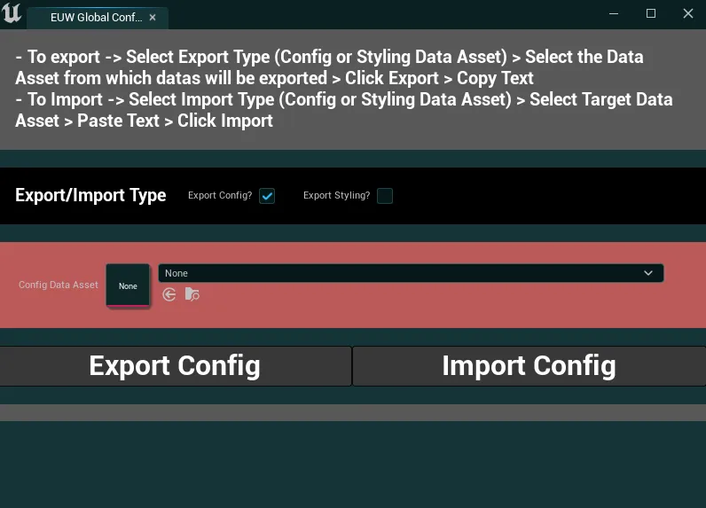
Once open, you will be presented with the following UI
-
In here, you can first select which data asset type you want to export data from/import data to, either the Global Config Data Asset, or the Global Styling Data Asset

-
Inside the field
Config Data Asset/Styling Data Asset, select the target Data Asset
-
You can then either export or import datas with the following steps
-
To export datas, simply click on the
Export Configbutton, a text that you can copy will then appear containing all the informations about that data asset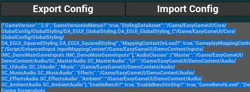
-
To import datas, first paste the config text inside the grey field, then, click on the
Import Configbutton
Warning
Importing a config will overwrite any data that were previously stored in the data asset. Make sure to have selected the correct data asset and correct type.
If the config text doesn’t match the data asset type, it won’t do anything.
-