Hud Building Toolkit
The Hud Building Toolkit consist in various sytems designed to handle the in-game HUD (health bars, objectives, level up notifications, etc), you will find all the necessary details to use the system in this page. (It is recommend to follow these steps in order)
Quick Start Guide with the Hud Building Toolkit
1. Core Concepts
To get started with the Hud Building Toolkit, let’s start by understanding the 2 core concepts of the system: Contexts and Modules
-
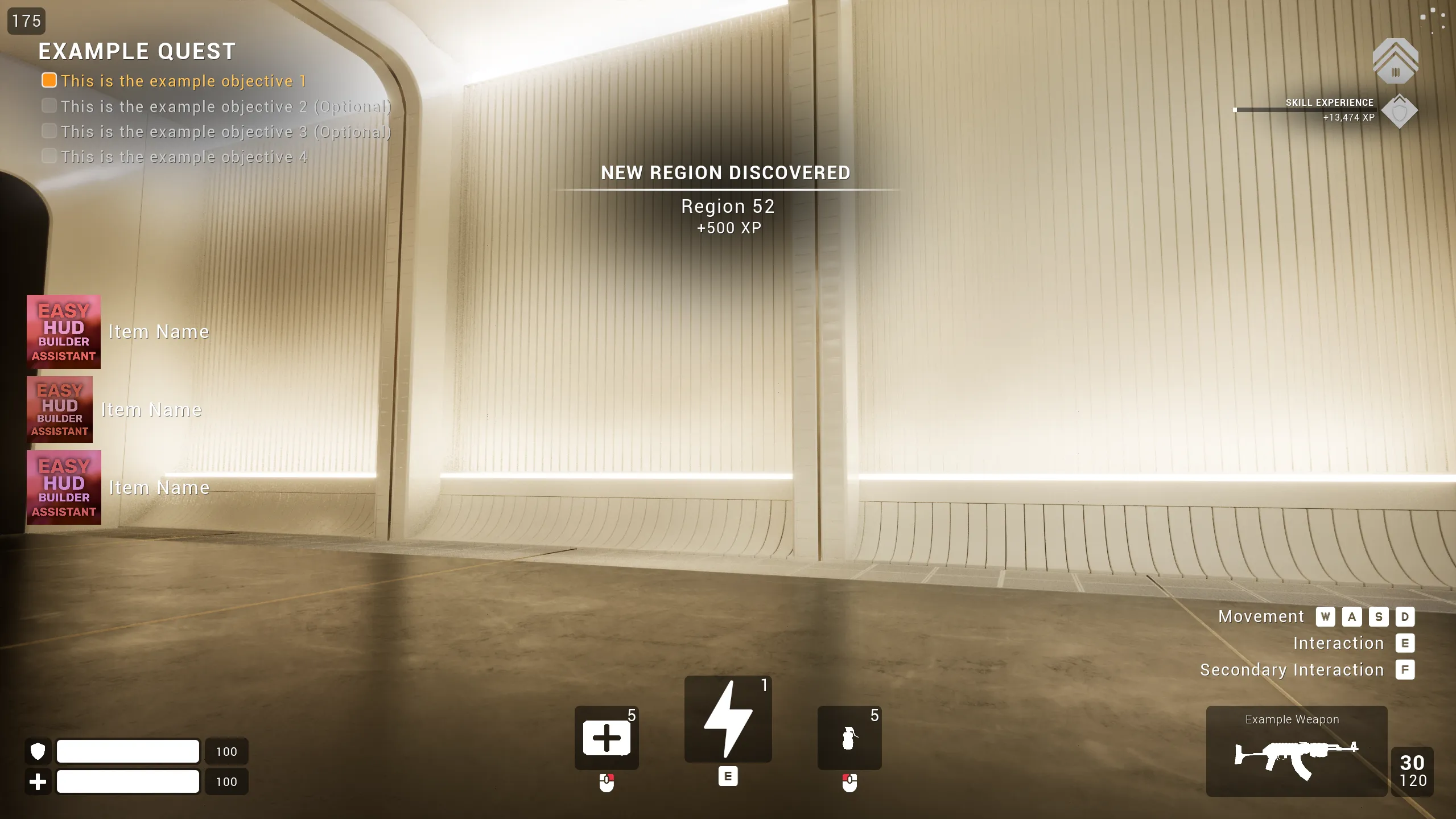
ContextsThe Context-based system allows different HUD layouts to be shown depending on gameplay state (combat, exploration, driving, etc). Contexts can be modified to contain any module and allow for a very easy switch between groups of widgets.Example of context with all the built in modules shown:
-
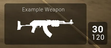
ModulesModules describe Widgets that can be displayed on the HUD based on the active context (health bars, weapon displays, quest indicators, etc)Example of a single module displaying the currently equipped weapon:
Note on modules initialization
By default the built in modules do not display anything even if they are shown by a context, this is by-design and simply because all the modules require a minimum initialization step from your own gameplay systems.
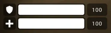
For example, the Player Health Status will only display something once you have called a function on it to define which health bar must be visible and how many HPs the player has. This will be described much more in depth in a following section of the documentation
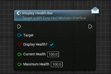
Function Call 1 to display health bar
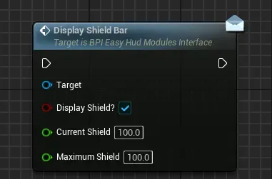
Function Call 2 to display shield bar
Final Initialized State
2. Creating your own Modules Definition asset
To get started building your own HUD, let’s create the data asset that will contain all your modules datas (names, contexts, layout, etc)
-
Go to any folder in your project and create a new data asset
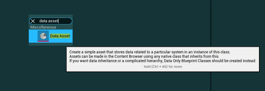
-
In the class picker, search for
PDA Hud Modules Definitionand select it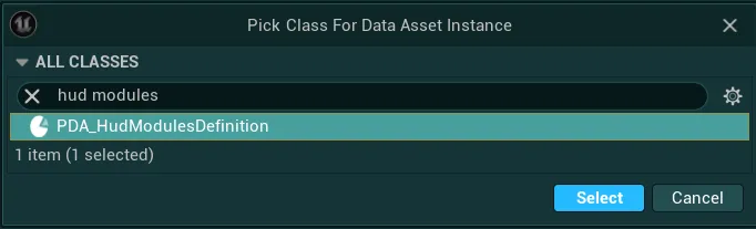
-
Give it a name of your choice and you now have a new data asset to work with
By default it is populated with the built in modules, you can delete them directly inside the data asset if you want to start fully from scratch
-
For the system to work with that data asset, open your Global Config Data Asset and locate the variable
Hud Modules Definition Data Asset
Then in the variable, simply set the data asset you just created as value
3. Introduction to the Easy Hud Builder Assistant tool
Now that we saw those core concepts and created your data asset, let’s do quick introduction to the Hud Builder Assistant tool, this tool will be essential in easily handling the contexts and modules for your HUD
-
To open it, go to the folder
EasyGameUI/EasyHudBuilder/Core, right click on theEUW_EasyHudBuilderAssistantand selectRun Editor Utility Widget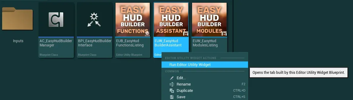
-
With the new window opened, make sure to set it fullscreen to have the best experience, then press continue
-
You will immediately be presented with the following screen that shows all the modules from the Demo Context (except if you changed the Default Hud Context in the config or cleared the modules data asset)
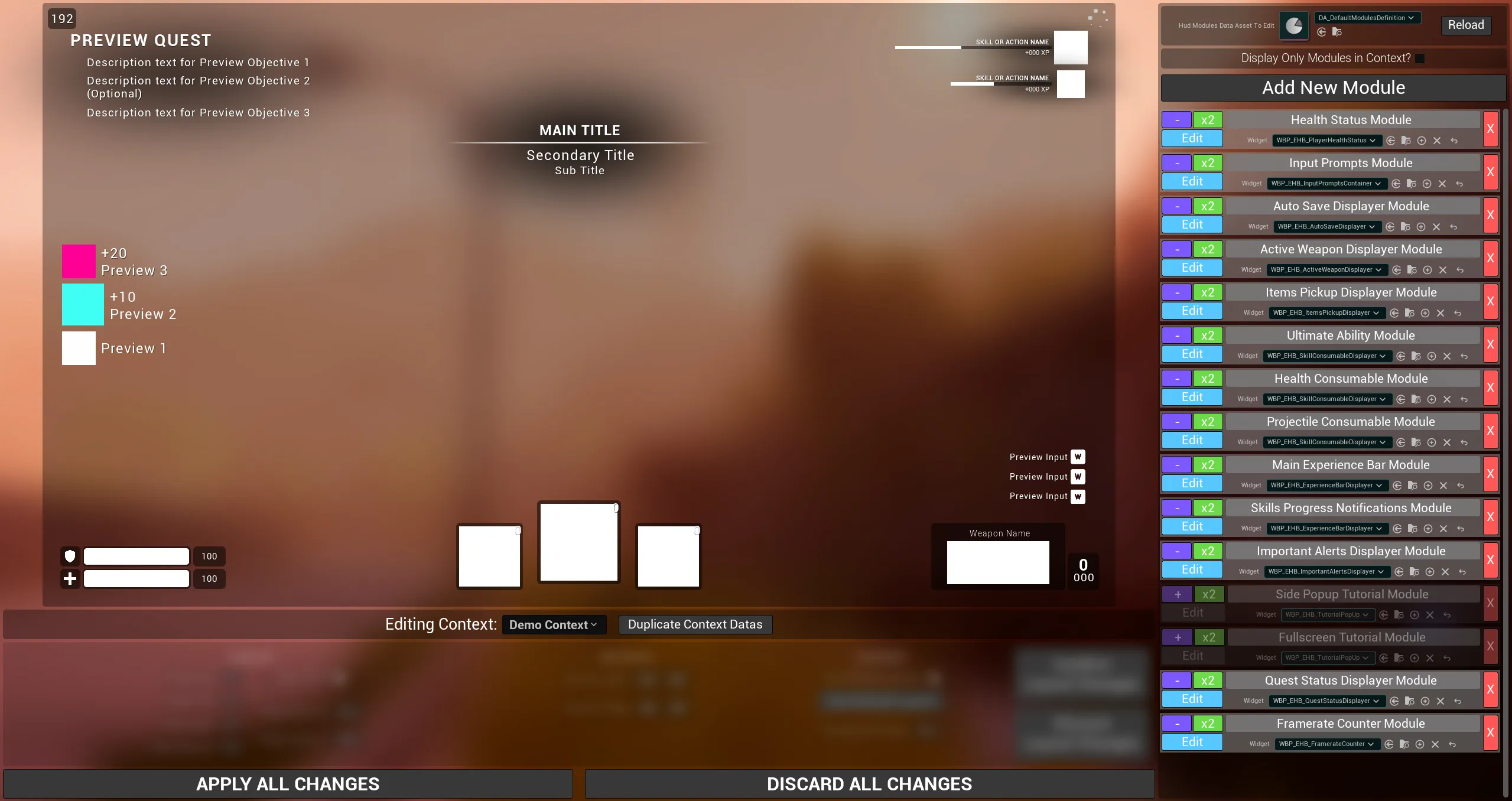
I will be describing this tool much more in depth in a next section of the documentation, let’s just talk about the basics for now:
- On the right you will find everything related to modules with a list of built in modules and several controls such as a widget selector, name field, etc
- On the left you will find a preview of the currently selected context and various controls to change the layout of modules during edition
This tool is where you will be able to select which Modules goes in which Contexts (if any), change their layout (location, size, zorder) and select the widget they use
-
Let’s do a quick test example to give you a first idea of how the tool work:
-
First, on the top right, make sure that your custom Modules Data Asset is selected (the one you created just before)

-
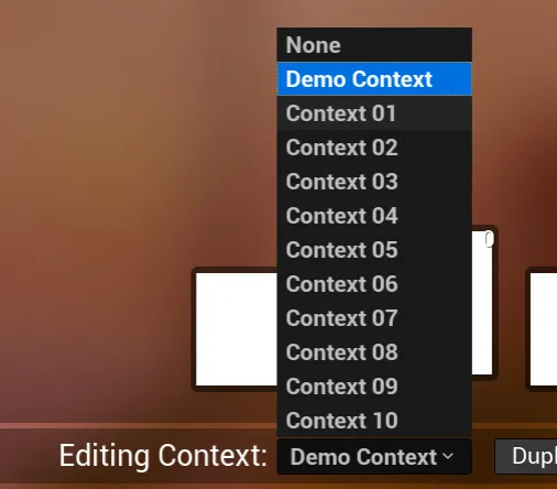
Then, let’s select the Context 01 from the list of contexts (just below the preview area)
-
Once done, you will now have a blank canvas and all the modules greyed-out on the right, this means they are not currently selected in the Context
-
Let’s reuse the Health Status Module as an example, click on the purple
+button on it in the list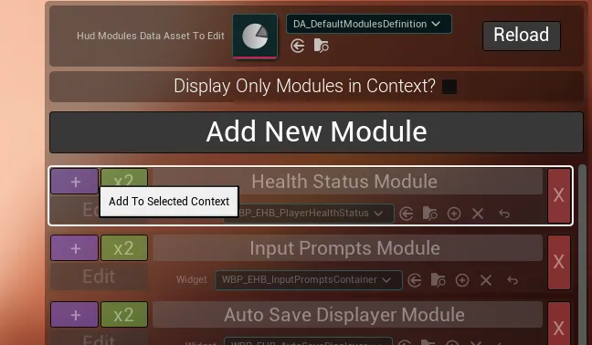
-
Once done, you should then be able to see the module on your preview canvas, click on it and try dragging it around
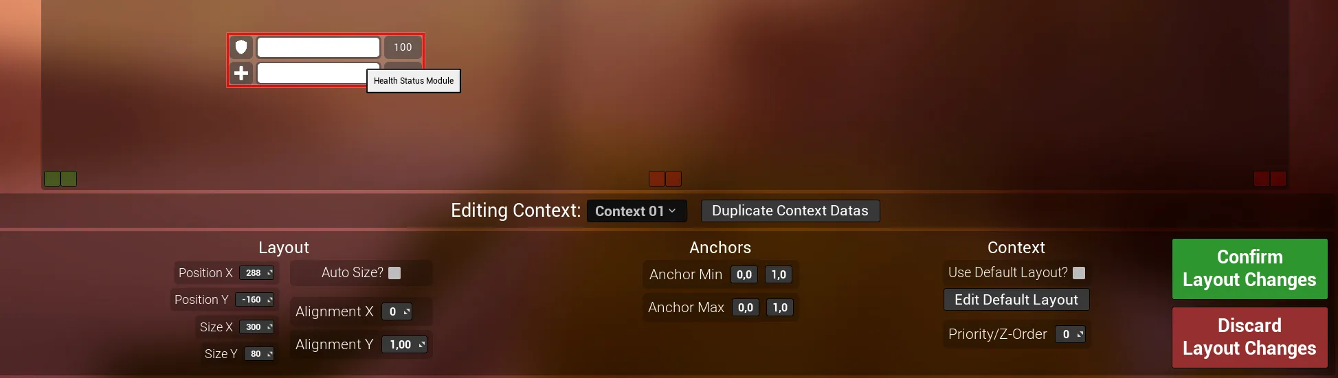
-
Once you moved it a bit, click on the
Confirm Layout Changesbutton - Then press on the
Apply All Changesbutton, this button will validate the changes and add them to your Modules Data Asset to be reused during gameplay
-
-
You now have successfully set up your own Hud Context, let’s try it out in action!
4. Using the Hud System during gameplay
To wrap up this quick start guide, I will show you how you can enable your Hud Context you’ve just set up and how to initialize the Health Bar
- To do so, open any of your gameplay levels (a gameplay level where you already have a functioning BP_EasyMainGameHUD set up in the hud setup guide of the documentation)
-
Then, open the Level Blueprint for the selected level
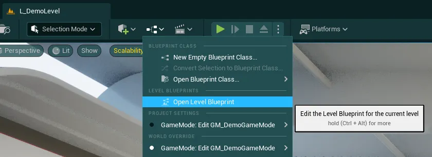
Note
I will be using the level blueprint for this demonstration but this logic should be in your game code, ideally the level blueprint shouldn't be use for gameplay related systems like this
-
Let’s add a begin play event and call the function
Get Easy Hud Builder Manager, this manager will give us control over the entire system through many utility functions, I would suggest to make a variable to make the rest cleaner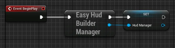
-
We first need to wait for the manager to be fully initialized, for that, simply check if it is already initialized with the function
Is Hud Manager Initialized?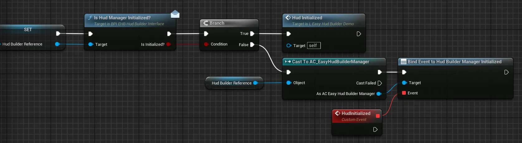
If True, we can simply proceed with our normal execution. If False, you can add a
Cast To AC_EasyHudBuilderManagerto bind to theHud Builder Manager Initializedevent -
Now that we know the Hud is ready, we just need to switch to our newly set up context with a simple call to the function
Switch To New Hud Context, set the Requested Context to Context 01 (or the context that you used to test earlier)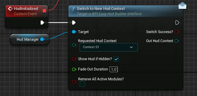
If you do not want to always have to reselect your context at begin play, you can also select it as
Default Contextfrom the Global Config -
Then, we simply need to make sure our health bar is initialized with the data we want, to do so, let’s first call the function
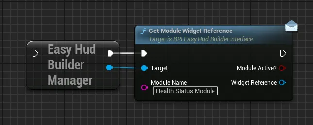
Get Module Widget Referencewith the name of our moduleHealth Status Module(same name as displayed in the tool earlier)And then we simply call the
Display Health Barfunction. This initialization logic will apply to all the built in modules, they won’t display anything by default until your system explicitely told the module to initialize with some data you provide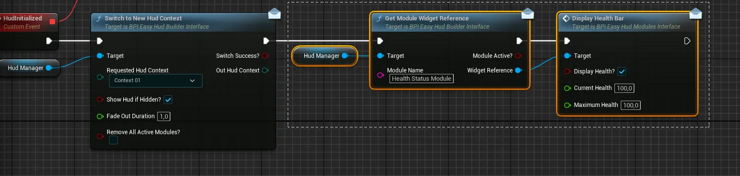
-
You can now play in your level and should be able to see your health bar in the spot where you placed it!
If you want a more in-depth showcase of all the built in modules and various systems presented here, check out the level L_EGUI_HudBuilderDemoLevel!
This wraps up the quick start guide, you should have a better understand of how the whole system works, you can now go more in-depth with the following documentation sections:
- Hud Manager Utilities
- In-Depth Utilities Tools Presentation
- How to Create your Own Modules
- How to Use the Built-In Modules
Hud Manager Utility Functions
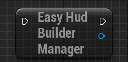
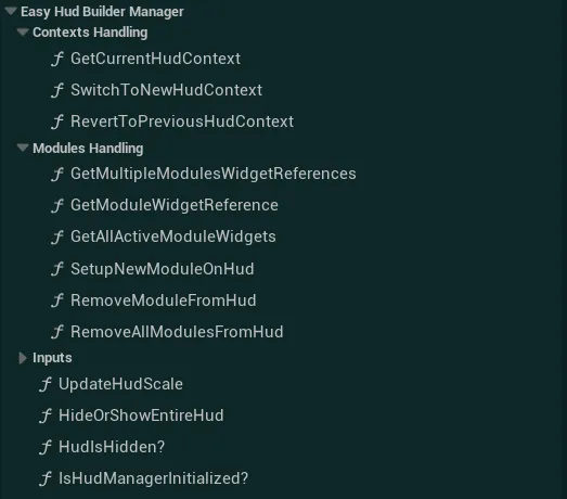
To control the HUD, you have access to various functions that you can call on the Hud Builder Manager. You will first need to get the reference of the component by using the function Get Easy Hud Builder Manager
Note
If you need to call any functions on the hud builder right at begin play, remember that you will need to wait for it to be fully initialized, you can use the provided Hud Builder Manager Initialized event for that
You can either access it from anywhere by getting the reference to the hud builder and binding onto the event like so:
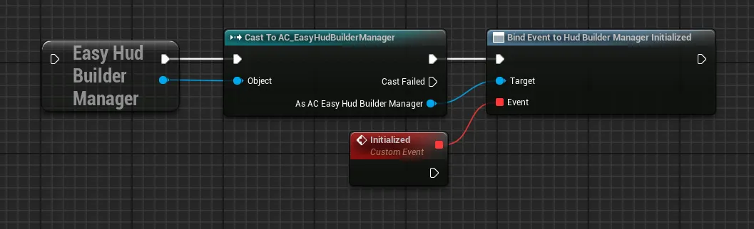
From there, you can call any of the following functions under the Easy Hud Builder Manager section, you can find more detail on each function in the dropdowns right below
Get Current Hud Context
Get the currently displayed Hud Context and return if different from the input context
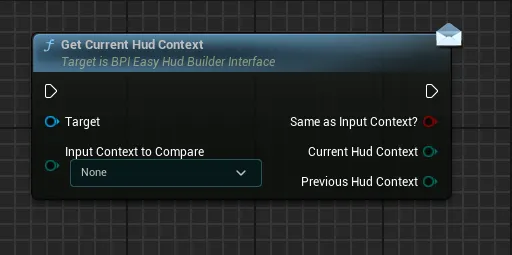
InputContextToCompareInput Context to check if the currently active context is set to this value or not
SameAsInputContext?Return True if the Input Context To Compare is the same as the Current Hud Context, False otherwiseCurrentHudContextCurrently selected Hud ContextPreviousHudContextPreviously selected Hud Context (before the last context switch, if any)
Switch to New Hud Context
Switch to a new defined hud context, removing all the modules from the previous context to display the new required modules
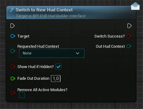
Requested Hud ContextTarget context that will be used to define which modules need to be displayedShow Hud If Hidden?If True, the hud will be forced to be shown again if it had been hidden before. If False, the Hud might remain hiddenFade Out DurationControl how long the current context will take to fade out before fading in the new contextRemove All Active ModulesIf True, all the modules on the hud (manually added and from context) will be removed, if False only the modules from the previous context will be removed, leaving any manually added module
Out Hud ContextReturn the newly active Hud Context, or the current one if the switch has failed, the switch has been aborted or this context is the same as the already active context
Revert to Previous Hud Context
Calling this function will revert to the last valid hud context
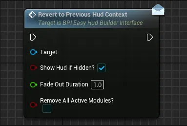
Show Hud If Hidden?If True, the hud will be forced to be shown again if it had been hidden before. If False, the Hud might remain hiddenFade Out DurationControl how long the current context will take to fade out before fading in the new contextRemove All Active ModulesIf True, all the modules on the hud (manually added and from context) will be removed, if False only the modules from the context will be removed, leaving any manually added module
Get Multiple Modules Widget References
Retrieve the widgets reference of the given modules
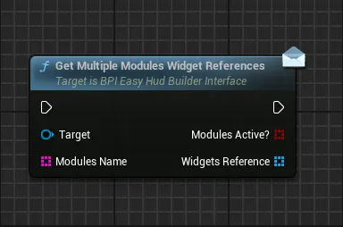
Modules NameArray of the unique name for the modules that need to be retrieved
Modules Active?Return an array of booleans corresponding of the input names array. Return for each given index if the associated module is currently valid and displayed on the HUD (either added manually or added from context)Widgets ReferenceReturn an array of widget references for the requested modules. The returned widgets are in the same order as the input names array.
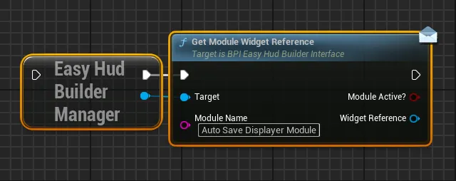
Get Module Widget Reference
Retrieve the widget reference of any given module defined by the name
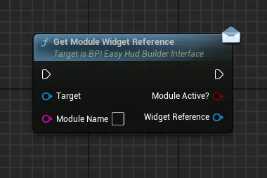
Module NameUnique name of the module that need to be retrieved
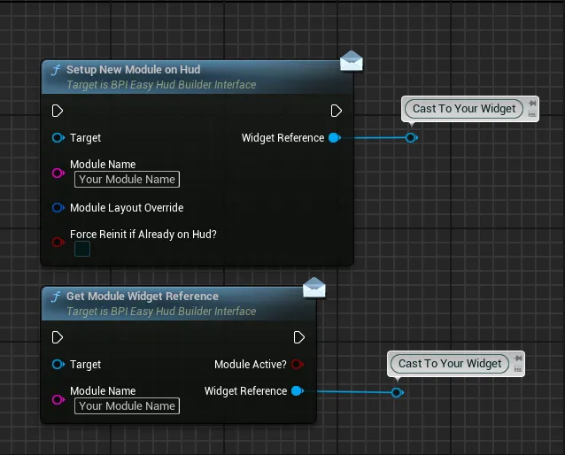
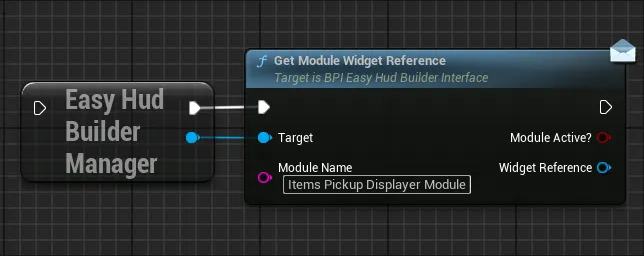
Module Active?Return True if the module is currently valid and displayed on the HUD (either added manually or added from context)Widget ReferenceReturn the reference of the widget on which you can call any of the BPI functions. For custom widgets, you can also use a “Cast To” node in order to call any custom functions you may have defined. This widget reference is always the same for a given module so it is safe to keep that as a variable.
Get All Active Module Widgets
Retrieve the references of all the modules widgets that are currently active on the Hud
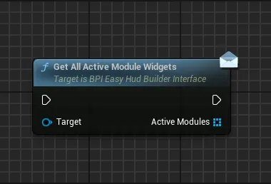
Active Modules Return the references of all the widgets currently valid and displayed on the HUD (either added manually or added from context)
Setup New Module on Hud
Manually add a given module to the Hud, the default layout of the module will be used in this situation unless overidden
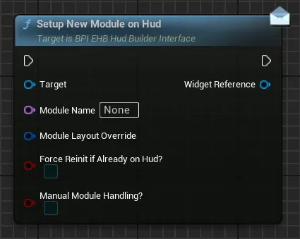
Module NameUnique name of the module that need to be added on Hud-
Module Layout OverrideSet of datas that allow to override the default widget layout based on needs, if you wish to override this layout, simply set theOverride Widget Default Values?checkbox to True and input your own module layout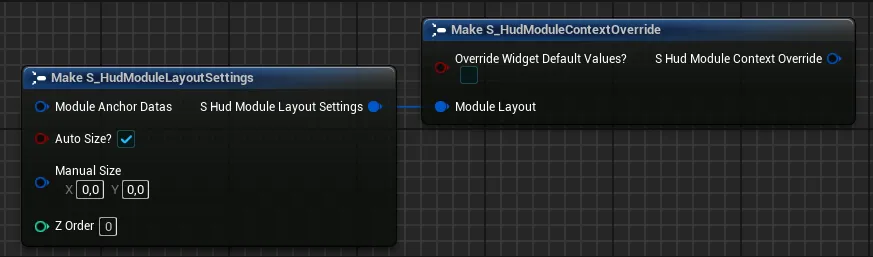
-
Force Reinit If Already on Hud?This setting only apply if the widget is already on the Hud (either added manually or from context).If True, the widget will be forced to reinitialize (play all the fade in animations and any initialization code, reset the layout with any new values), if false this will just retrieve the reference of the module widget (like “Get Module Widget Reference”) and the layout will remain unchanged
-
Manual Module Handling?If True, the module will not be considered as part of a context or manually added modules and will have to be manually handled by your code (switching contexts will not clear it, only explicit "clear" functions can remove it)
Widget ReferenceReturn the reference of the widget on which you can call any of the BPI functions. For custom widgets, you can also use a “Cast To” node in order to call any custom functions you may have defined. This widget reference is always the same for a given module so it is safe to keep that as a variable
Remove Module From Hud
Remove a given module from the Hud, regardless of the way it was added (manually or from a context)
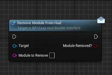
Module To RemoveUnique name of the module that need to be removed from the Hud
Module Removed?Return True if the module was successfully removed, if the value is False, it means that the module was not active on the Hud or was not found
Remove All Modules from Hud
Remove all the modules currently active on the Hud depending on the selection
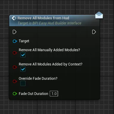
Remove All Manually Added Modules?If True, any module that has been manually added and that is active on the Hud will be removedRemove All Modules Added By Context?If True, any module added from the current context will be removed from the Hud (the context will be set to None)Override Fade Duration?If True, the fade out duration of the modules will be ignored and instead all the modules will use the defined fade out durationFade Out DurationControl the duration of the fade out if the override is needed
Update Hud Scale
Update the global scale of the Hud, affecting all the widgets in it. This can be useful to control from a setting for example
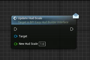
New Hud Scale New value of scale to display
Hide Or Show Entire Hud
Globally hide or show the hud, affecting only the visibility without modifying any of the modules or contexts currently active
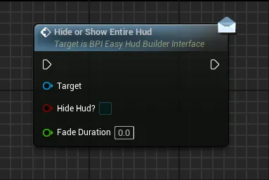
Hide Hud New visibility state of the Hud, calling the same state as the current visibility state won’t do anything
Fade Duration Duration of the global fade in/out animation if any
Hud Is Hidden?
Return the current global visibility state of the HUD as defined by the Hide or Show Entire Hud function
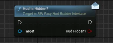
Hud Hidden? Current visibility state of the HUD after any Hide or Show Entire Hud function call
In-Depth Utilities Tools Presentation
Hud Builder Assistant
-
To open the main Hud Builder Assistant tool, go to the folder
EasyGameUI/EasyHudBuilder/Core, right click on the EasyHudBuilderAssistant tool and selectRun Editor Utility Widget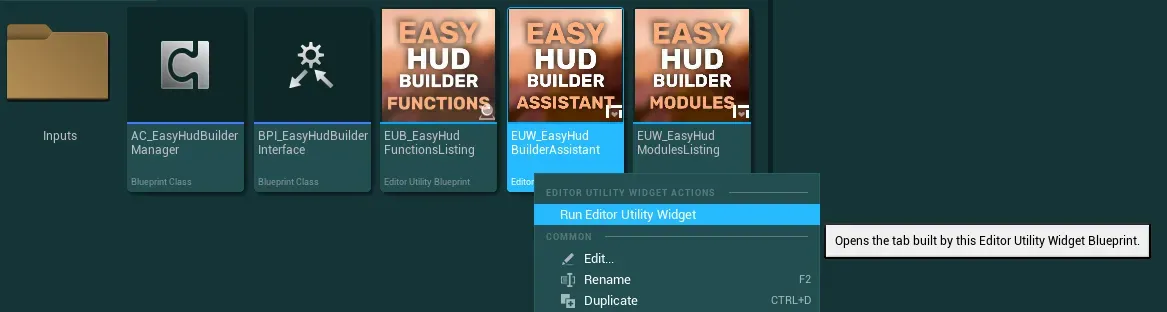
-
You will be presented with the following editor that you already saw earlier, let’s break it down in more details
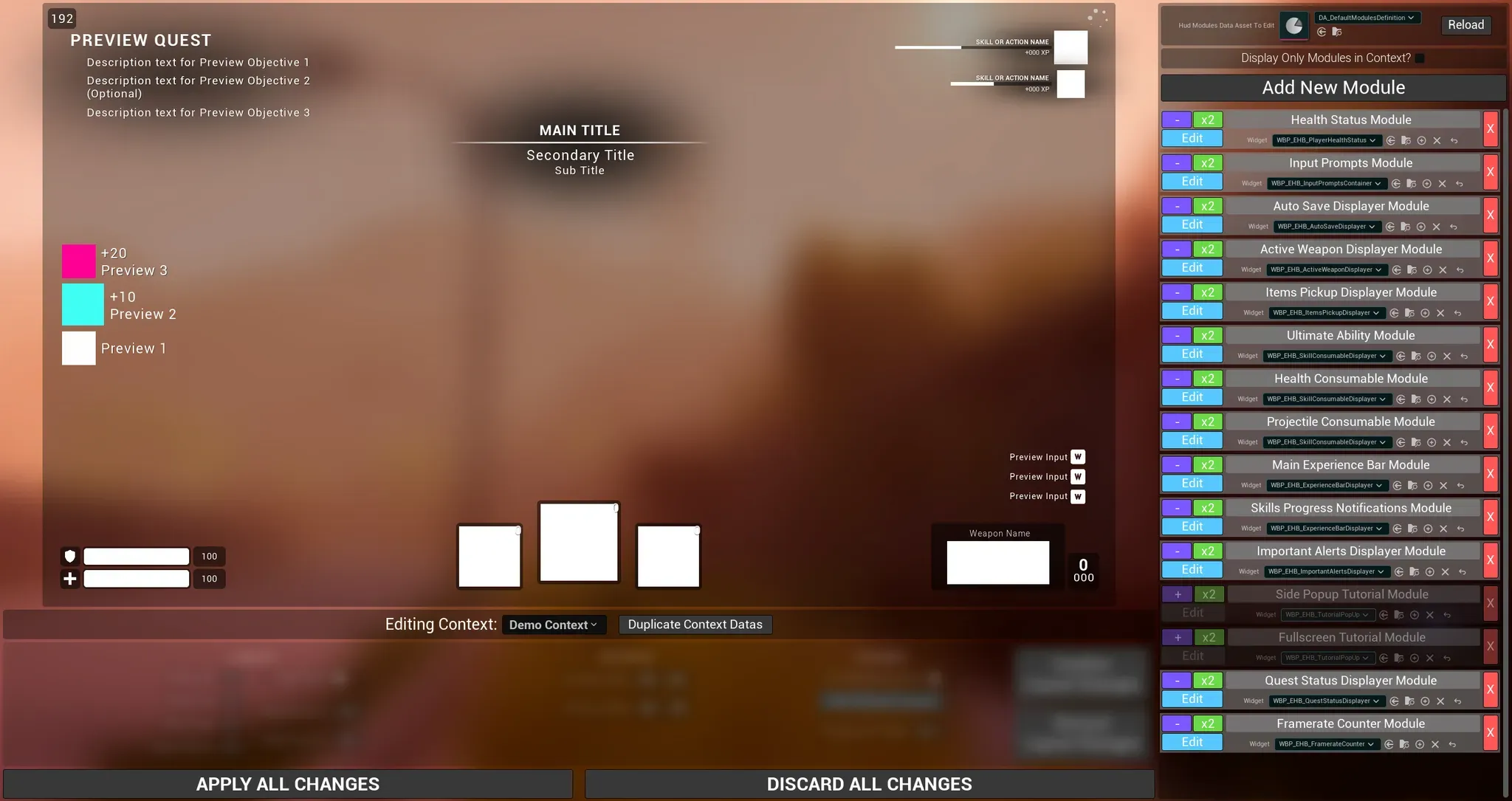
On the right panel you will find everything related to modules with a list of built in modules (expand to see more)
-
The first setting is the reference to the data asset that will store all the modules datas, this is where you can select the data asset you created You can also reload the data asset if you need it, any modifications not applied will be lost when reloading

-
The following setting allow you to filter out the list of modules to display only the modules in the editing context

-
To add a new module definition to the list, you can use the
Add New Modulebutton
-
And finally, each module definition has several settings, they can have two appearences if they are in the editing context or not

- The purple button
+or-allow you to add or remove any module from the current context (except theNonecontext of course) - The green
x2button allow you to duplicate the module definition with all its settings - The blue
Editbutton allow you to edit the layout of the module (the module needs to be in the context to be edited) - The module display name can be modified with the text box
-
The widget associated with the module can be defined with the class selector right below the name. Multiple modules can have the same widget class
I strongly recommend to not modify any of the built in module names or widget in the data asset (unless replacing the widget by a copy/duplicate). If you do, the demo content might no longer work properly.
-
Finally, the big red button will delete the module entirely from the data asset
- The purple button
On the left panel you will find three main parts (expand to see more)
- The large rectangle is the canvas hud displayer, where you will be able to preview all the widgets and contexts
-
Right below it, you can find a selector for the context to edit alongside a button to duplicate any context data

How to edit the Contexts List
The list of contexts is defined by an enumerator. If you wish to add, remove or rename the contexts, check out the following steps:
- Go to
EasyGameUI/EasyHudBuilder/Datas/and open the enumE_HudContexts. In there you will find the default list of contexts, do not delete or modify the first two entries of the enum - You can freely modify the rest of the list or add new entries, I would however not recommend deleting any of the existing entries to prevent any issues
-
Once you made your modifications, make sure to close the Easy Hud Builder Assistant widget, then save all the changes

-
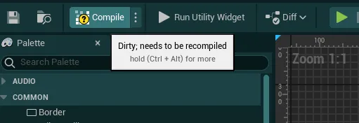
Open the Hud Builder Assistant widget (open for edition, not to use the tool) and press the “Compile” button
-
You can now reopen the tool and see the modified contexts in the dropdown
If you notice any inconsistent behaviors in any of the systems, restarting the engine should fix all of these
Note
If you notice that the widgets are not displayed properly when selecting a context, you can try to open the
WBP_EHB_HudBuilderModuleMaster(EasyGameUI/EasyHudBuilder/Core/HudModulesWidgets) and recompile it. Then re-open the Assistant toolIf the issue persist, restart the engine.
- Go to
-
The last panel contains all the layout settings that you can tweak when editing the layout of a module. Those are the same controls that you can find in UE widget editor

Apply All ChangesSave inside the data asset any modification made to the modulesDiscard All ChangesReload the data that are currently inside the Data Asset to Edit, discarding any unsaved changes made since then
-
-
With the introduction done, we can describe a bit more the edition of a module
Each module has multiple layout possible, a default one and one per-context, the
Editing Contextdefines which layout you are editing- If
None→ editing a module will edit its default layout values. Those values will be used when manually adding the widget - not as part of a context -
If
[Any other context]→ editing a module contained in that context will edit the layout values of that module when displayed with the selected contextYou can also choose to use the default layout values even when displaying from the context by setting the
Use Default Layout?variable to true when editing the module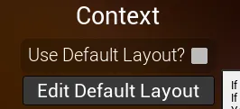
When editing a module, the module will be highlighted by a red outline, you will then be able to set any layout options or drag/resize it around directly with the controls on the module itself
You will also see a set of squares appearing, those squares can help you quickly set the Anchors of the module (the same Anchors settings that can be found in the layout settings panel). The first square of each set will define the
Anchor Min, the second square will define theAnchor Max. You can also manually input the anchors if you need more precise values.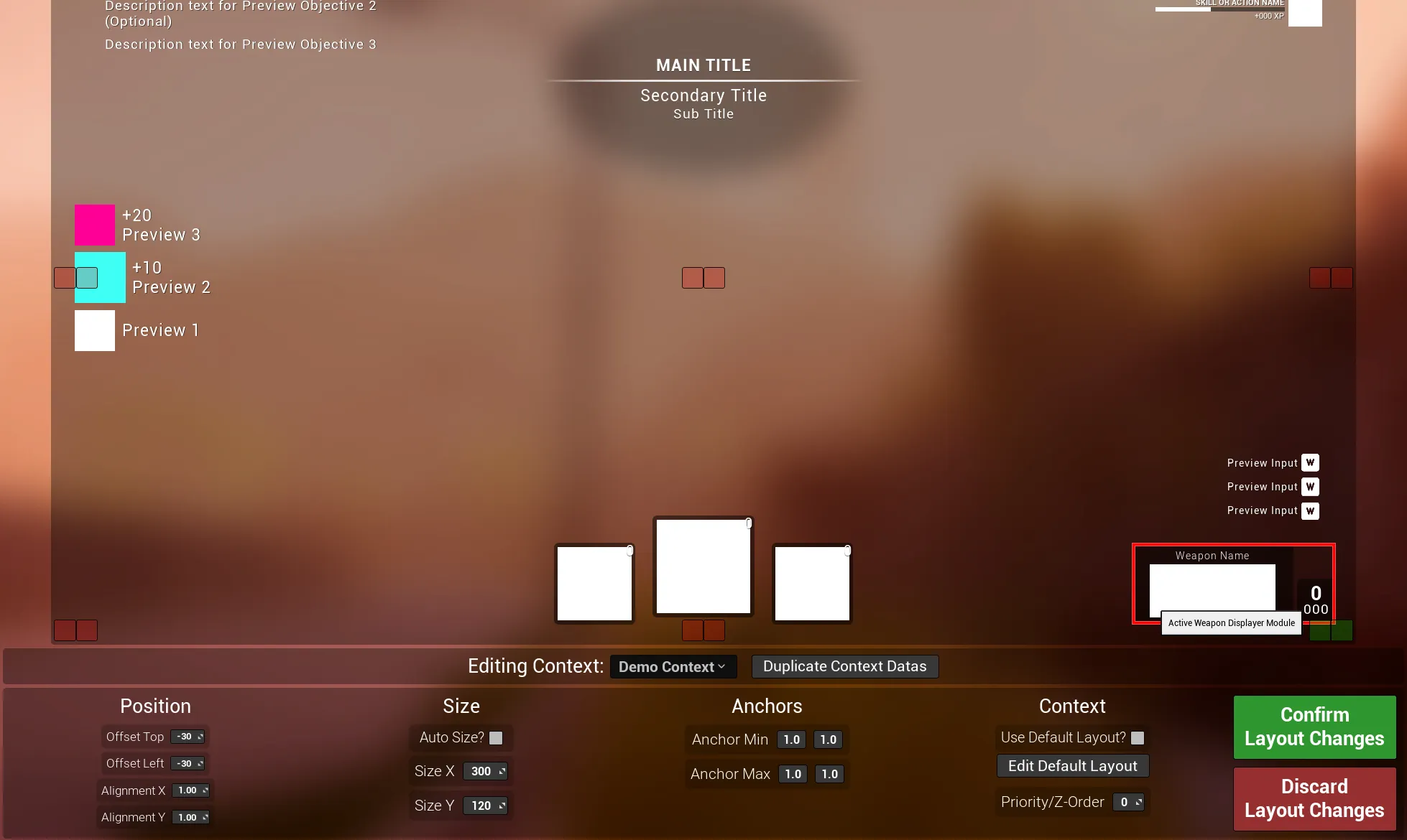
- If
Additional Tools
In the same EasyGameUI/EasyHudBuilder/Core folder you will also find two additional tools that can help you when working with the system
EUB_EasyHudFunctionsListing
A simple editor blueprint that you can open by double clicking on it
This blueprint contain every single function that you can call on the Hud Builder Manager or any of the built in modules
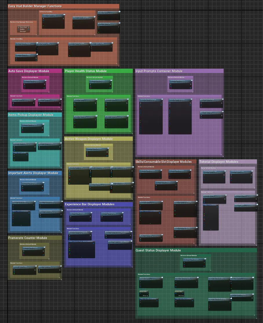
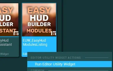
EUW_EasyHudModulesListing
Another editor utility widget that you can open by right clicking on it and selecting Run Editor Utility Widget
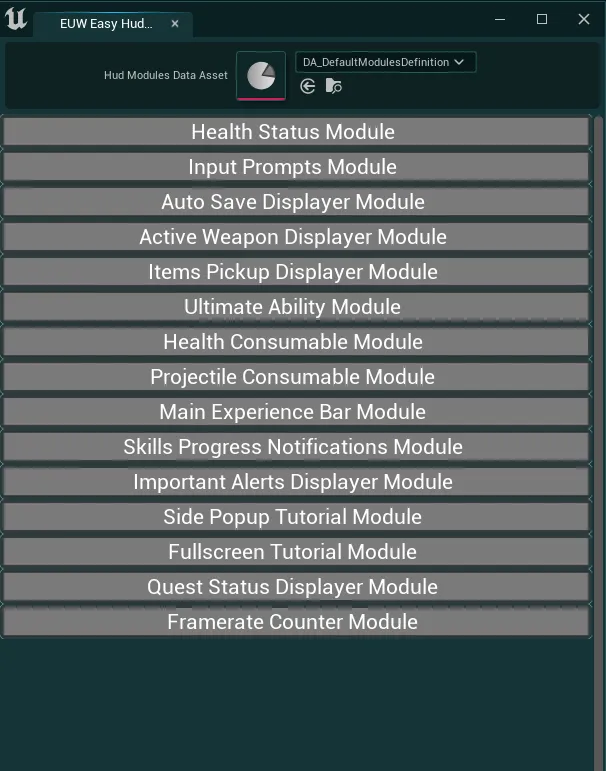
This utility widget will simply list every single module that is contained inside a given modules definition data asset. Each module name can be easily selected and copied to use anywhere needed
Main Hud Widget
To display the HUD and all its associated widgets defined from the assistant tool, the system uses a main panel widget. You can find that widget inside the EasyGameUI/EasyHudBuilder/Core folder

This widget contains the main canvas panel, the scale box to change the hud scale as well as the global fade animation. In case you need to add custom logic or hard-coded elements to the hud, you can do so inside this widget.
However, make sure to not delete any of the existing elements
How to Create your own Modules
To create your own modules and be able to use any widget with the system, you will only need to create a widget child of the WBP_EHB_HudBuilderModuleMaster. The process will vary if you wish to convert an existing widget or create a new one, check out the following instructions:
Creating a new blank widget blueprint
A. Creating a new blank widget blueprint
-
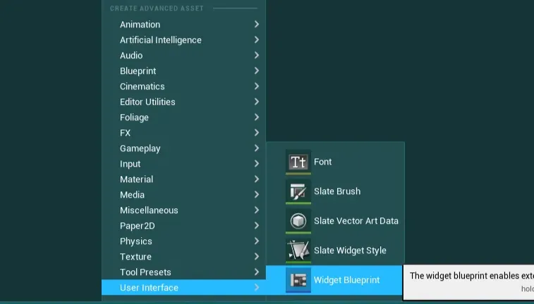
To get started, create a new widget in any folder
-
In the class picker, search and select the
WBP_EHB_HudBuilderModuleMasterclass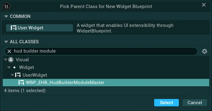
-
Once the widget is created, you can check out the next section “Configure and use the module widget”
Using an existing widget blueprint
B. Using an existing widget blueprint
When using an existing widget, I would recommend making a duplicate of it to have a backup in case you wish to go back.
-
Open the widget you want to use, then go to the
Class Settingsand locate theParent Classsetting
-
If that parent is a simple “User Widget” (Default engine widget class), then simply search for
WBP_EHB_HudBuilderModuleMasterand reparent it, once that is done you can check out the next section to configure and use it.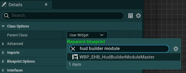
-
However, if that widget already has a different parent (not the default engine widget class), you will need to find the parent and do the same reparenting process on the parent (only on the parent). A simple solution can also be to migrate the logic of that widget inside a new blank module (the creation of a blank module is shown in the previous section “Creating a new blank widget blueprint”)
How to configure and use the custom module widget
-
With your widget ready, under
Class Defaults>Easy Config, you can change several base parameters for the module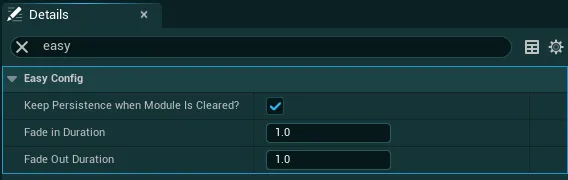
-
Keep Persistence When Module Is Cleared?-
TrueThe module widget will be kept persistent even when cleared: It is set as collapsed (hidden), timers, delays and functions can still work in the background and the widget won't be reset when added again to the hud. This is useful when you need to keep the same informations displayed when switching contexts for example. Otherwise the information would be lost and need to be re-set manually -
FalseThe module widget will be removed from the hud entirely, stopping any events, timers or delays running on it. It will also reset its state and retrigger construction when added back to the hud
-
-
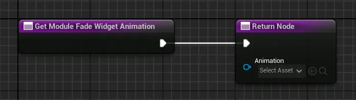
Fade In Duration&Fade Out DurationControl the base duration of the fade in and fade out animations of the moduleYou can also override the animations directly by overriding the function
Get Module Fade Widget Animation:
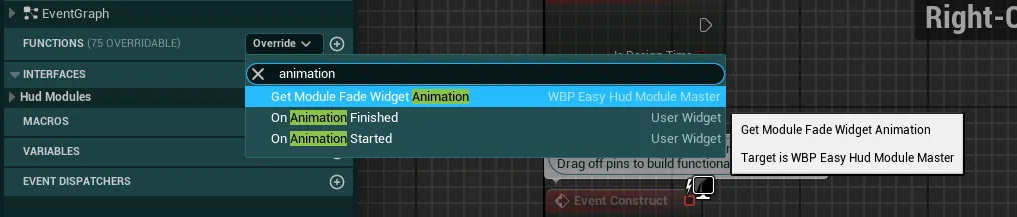
In there, you can specify a new animation that will be used when fading in/out (the animation should support both with the fade in being played "forward" and fade out played "reverse")
-
-
Once you are done, simply add the widget to a module definition from the Assistant tool as described earlier
-
Then, you can build your widget like any other with all the functionnalities you need. If you wish, you can implement any of the functions from the blueprint interface, add new ones directly in the
BPI_EHB_HudModulesInterfaceor directly hard coded in the widget if you prefer.You can check out every single available function from the tool
EUB_EasyHudFunctionsListing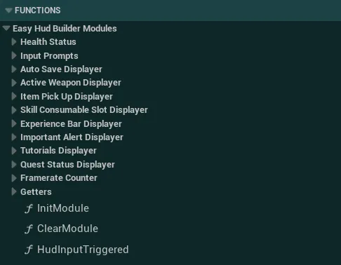
-
You can also override several functions from the parent widget to execute any code on init/clear or displaying a preview inside the assistant tool
Execute any code on Module Initialization or Module Clear
-
To get started simply override the following events based on your needs:
Init Module/Clear Module
-
Then, make sure to call the parent function by right-clicking on the function and selecting
Add Call to Parent Function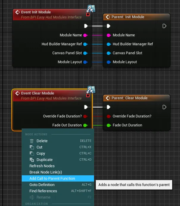
-
You can then execute any code after the parent node.
The
Init Moduleevent will be triggered every time the module is added to the hud (manually or from a context). Be mindful, this is not the same as the Construct event that won’t always get triggered when adding the module to the hudThe
Clear Moduleevent will be triggered every time the module is removed from the hud
Display a preview inside the Hud Builder Assistant Tool
If your module doesn’t have any visible content by default, you may want to display a “fake” preview of the widget to better visualize it inside the Hud Builder Assistant Tool
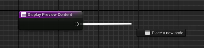
To do so, simply override the
Display Preview Contentfunction
You can then execute any code you need to display a preview. That code will only ever be executed when running the Hud Builder Assistant
-
-
Finally, use the
Setup New Module on HudorGet Module Widget Referencewith the name of your module to retrieve their reference and call any functions on it.If you need to access variables or hard coded functions/events (not from the BPI), you can take the Widget Reference output and simply use a Cast with your widget class
How to Use the Built In Modules
The system provides many built in modules that can be used for various common huds, you will find below the functions that they have and how to use them. You can find all those widgets inside the folder EasyGameUI/EasyHudBuilder/Core/HudModulesWidgets
If you wish to modify an existing widget, I would recommend duplicating the widget and replacing its reference with the Assistant Tool. Any built-in function will automatically work with that duplicated widget thanks to the use of blueprint interfaces.
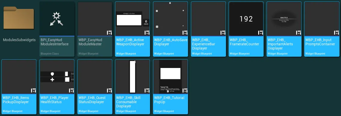
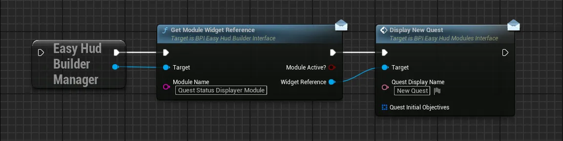
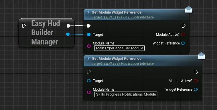
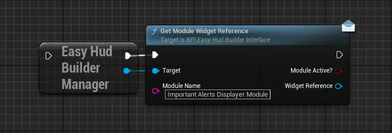
In order to use the built in modules in your gameplay, you only need to add them to your contexts (by default, they are set up on the demo context with the default data asset). And then retrieve their reference from their Module Name, at which point you can call any of the functions described below for each.
For example here we are retrieving the Quest Status Displayer module and calling the function to display a new quest:
Modules Definition:
Active Weapon Displayer
Active Weapon Displayer
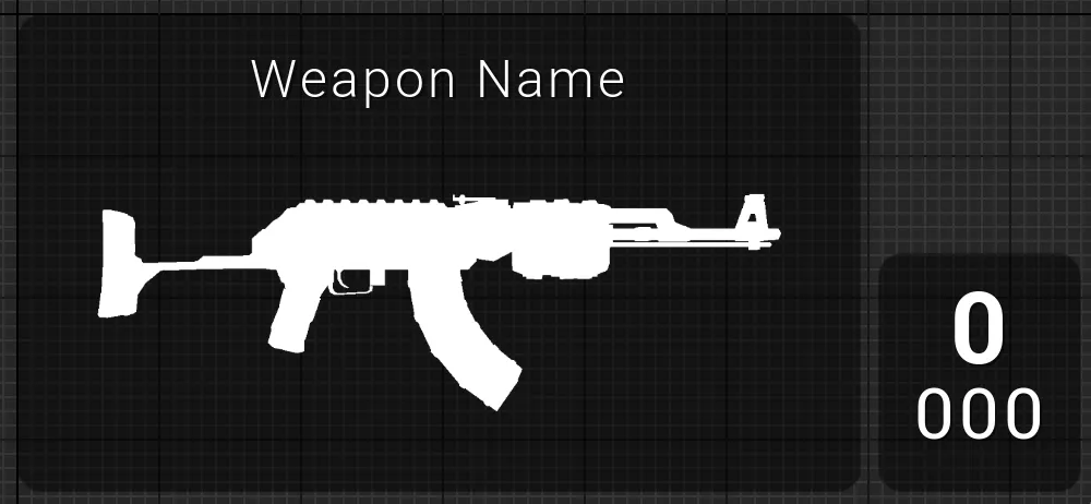
This module allow to display a weapon with an image, a name (facultative) and its current/max ammunitions
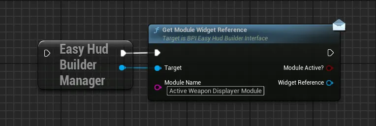
Functions:
Display New Active Weapon
Initialize or refresh the displayed weapon with new values
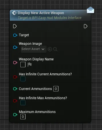
Weapon ImageA texture to display for the weapon, the ideal ratio of the image is around 1:2 (700px : 350px for example)Weapon Display NameFacultative name to display above the weapon imageHas Infinite Current AmmunitionIf true, the current ammunitions will be displayed as infiniteCurrent AmmunitionValue of current ammunition if not infiniteHas Infinite Max AmmunitionIf true, the max ammunitions will be displayed as infiniteCurrent AmmunitionValue of max ammunitions if not infinite
Update Current Ammunitions
Update the displayed current ammunitions (top value)
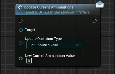
Update Operation TypeDefine how the new specified ammunition value is redefined compared to its current valueSet Specified ValueOverwrite the current ammunition value with the specified valueAdd Specified Value To CurrentAdd the specified value to the current ammunition valueRemove Specified Value From CurrentRemove the specified value from the current ammunition value (the final value will never be negative)
New Current Ammunition ValueThe specified value to consider while doing the operation
Update Maximum Ammunitions
Update the displayed maximum ammunitions (bottom value)
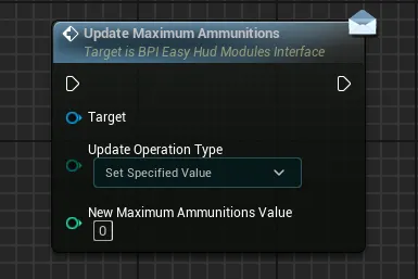
Update Operation TypeDefine how the new specified maximum ammunition value is redefined compared to its current valueSet Specified ValueOverwrite the current maximum ammunition value with the specified valueAdd Specified Value To CurrentAdd the specified value to the current maximum ammunition valueRemove Specified Value From CurrentRemove the specified value from the current maximum ammunition value (the final value will never be negative)
New Maximum Ammunition ValueThe specified value to consider while doing the operation
Update Infinite Ammunitions
Update the displayed infinite ammunitions if needed, allow to toggle on/off infinite ammunitions for the current or maximum
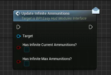
Has Infinite Current AmmunitionIf true, the current ammunitions will be displayed as infiniteHas Infinite Max AmmunitionIf true, the max ammunitions will be displayed as infinite
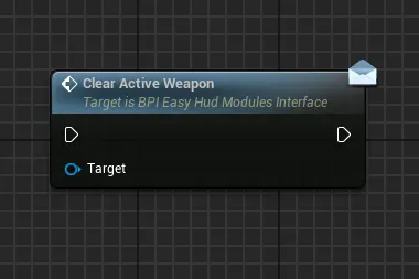
Clear Active Weapon
Clear and hide the currently displayed weapon if there are any
Auto Save Displayer
Auto Save Displayer
This module allow to display a simple auto save throbber when needed
Functions:
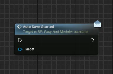
Auto Save Started
Start to display the auto save throbber for an indefinite amount of time
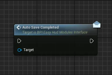
Auto Save Completed
Stop and hide the auto save throbber
Experience Bar Displayer
Experience Bar Displayer
This module allow to display a main experience progression bar and/or secondary skills progression bars
The default layout uses two different modules to split the main progression from the skills progression, you can also use a single module to display both if you wish

Functions:
Display New Experience Progress Bar
This function handle all the logic to display experience bars, calling this function again on the same module will create a queue to display all the needed progress bar animations one at a time
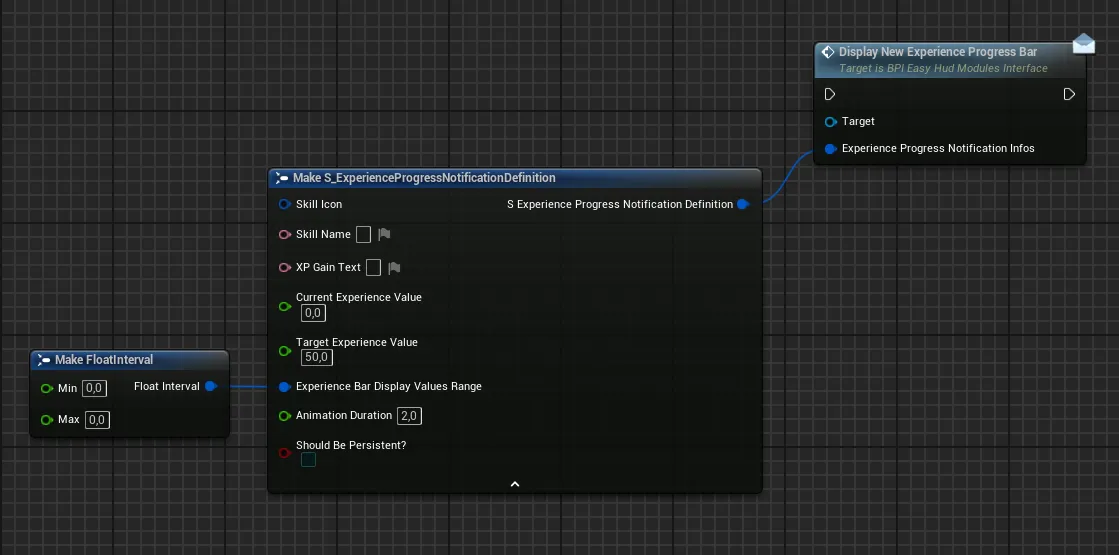
Skill IconIcon to display for the skill, the icon should be squareSkill NameName of the skill/Action that triggered the xp progression, displayed above the progress barXp Gain TextText to display below the progress bar to inform what kind of gain this action has caused (should usually be the value of xp gained, but can be anything you wish)Current Experience ValueInitial value of the progress bar, from which the animation will be executed, should be contained inside the display rangeTarget Experience ValueFinal value of the progress bar that will be reached at the end of the animation, should be contained inside the display rangeExperience Bar Display Values RangeXP range of the progress bar, these values should contain both the current and target values (example: Range 0→100, current 10, target 50)Animation DurationDuration of the xp gain animation, after which the progress bar will be fade outShould Be PersistentIf true, the experience bar will remain on screen after all the animations in queue are completed (only the icon will be visible, not the progress bar)
Clear Experience Progress Notifications
Function to clear all the currently active non-persistent experience notifications and notifications in queue as well as any currently active persistent notification.
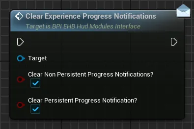
Clear Non Persistent Progress Notifications?If True, any non-persistent progress notification will be clearedClear Persistent Progress Notification?If True, any active persistent progress notification on this module will be cleared
Input Prompts Container
Input Prompts Container
This module allow to display multiple input prompts to inform the player of any actions he can do and which keybinds are associated with those actions. Thanks to the built-in Input Prompt system, those inputs will automatically detect key rebinding and device change (gamepad, keyboard, mouse)
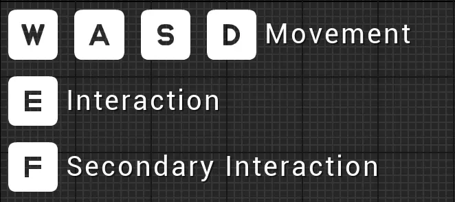
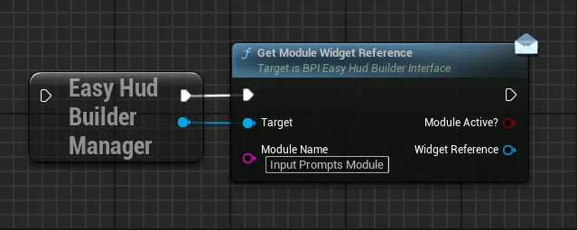
Functions:
Display New Single Input Prompt
Display an input prompt with all its associated details (text, input, styling), useful for action that only use one input per device like a simple interaction
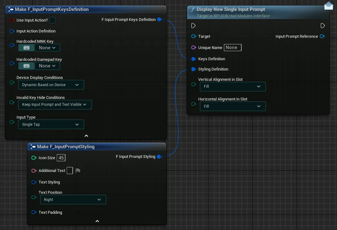
-
Unique NameUnique Name for the input prompt, this name can be used to clear this specific input prompt later on -
Keys DefinitionSet of variables defining which key need to be displayed (expand for more)Use Input Action?If you want to use an input action to display an input, tick this checkbox. Leave it unticked if you want to hard-code the keys-
Input Action DefinitionIf you ticked the previous checkbox, you now need to fill in the details about the input action that you want to display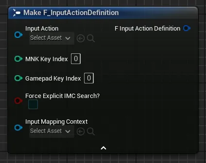
Select the Input Action in the dropdown and the Input Mapping Context from which you want to gather the keybinds
If the selected Input Action has more than 1 key per device in the mapping context, then you need to identify which key index you wish to display.
In the example below, there are 4 indexes for keyboard keys and 2 indexes for gamepad keys. If you want to display “D” and “Thumbstick X-Axis”, you need to enter the indexes 3 and 1 in the respective fields.
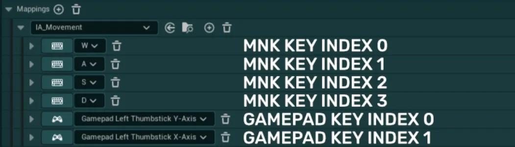
-
Hardcoded MNK Key&Hardcoded Gamepad KeyIf you did not tick the previous checkbox, you can now enter the hard-coded keys that you want to display using the two dropdowns and typing the name of the key
You don’t need to enter both keys. You can just enter one of the two if you want to display a key for a single device
-
Device Display ConditionsThis variable has three options that control the display of the keys:Dynamic Based on Devicewill allow the input prompt to display both gamepad and mnk keys based of the device usedOnly Mouse & Keyboard Keyswill only allow mnk keys to be displayed, regardless of the device usedOnly Gamepad Keyswill only allow gamepad keys to be displayed, regardless of the device used
-
Invalid Key Hide ConditionsThis variable control how the input prompt should react if a key is invalid (either not the correct device, or key not found, etc.)Keep Input Prompt and Text VisibleThe Input Prompt and Text will stay visible when using another device or if the key is invalidHide Input Prompt OnlyThe Input Prompt will be hidden but the Text may still be visible when using another device or if the key is invalidHide Input Prompt and TextThe Input Prompt and Text will be hidden when using another device or if the key is invalid
For example: If you set the input prompt to display only Gamepad Keys, setting this variable as "Hide Input Prompt Only" allows you to hide the input when the player uses a keyboard instead of gamepad
-
Input TypeThis variable allow to select which input type the key should display between three options:Single TapA basic single tap key for most use casesHoldA key that must be held for a specified amount of timeButton MashA key that must be repeatedly pressed for a specified amount of time
-
Styling DefinitionSet of variables defining the styling of the input prompt (expand for more)Icon SizeThis setting define the size of the displayed input prompt icon in pixelsAdditional TextOptional text to display near the key. You can leave it empty if no text needs to be displayedText StylingSet of options to control the text font, transform policy and justificationText PositionOption to control the position of the text relative to the key icon. Only the right alignment and left alignment can be selectedText PaddingOptional padding to add around the text
-
Vertical Alignment In Slot&Horizontal Alignment In SlotControl the alignement of the input prompts widget inside the container
Display New Multi Input Prompt
Display multiple input prompts at once with all the associated details (text, inputs, styling), useful for actions that have multiple inputs attached like movement
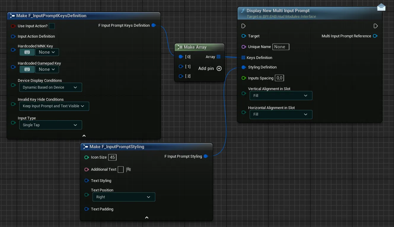
Unique NameUnique Name for the input prompt, this name can be used to clear this specific input prompt later on-
Keys DefinitionArray of structures defining which keys need to be displayed (expand for more)For each key you can configure the following variables, you can have as many different keys as you wish to be displayed by this single widget
Use Input Action?If you want to use an input action to display an input, tick this checkbox. Leave it unticked if you want to hard-code the keys-
Input Action DefinitionIf you ticked the previous checkbox, you now need to fill in the details about the input action that you want to displaySelect the Input Action in the dropdown and the Input Mapping Context from which you want to gather the keybinds
If the selected Input Action has more than 1 key per device in the mapping context, then you need to identify which key index you wish to display.
In the example below, there are 4 indexes for keyboard keys and 2 indexes for gamepad keys. If you want to display “D” and “Thumbstick X-Axis”, you need to enter the indexes 3 and 1 in the respective fields.
-
Hardcoded MNK Key&Hardcoded Gamepad KeyIf you did not tick the previous checkbox, you can now enter the hard-coded keys that you want to display using the two dropdowns and typing the name of the key
You don’t need to enter both keys. You can just enter one of the two if you want to display a key for a single device
-
Device Display ConditionsThis variable has three options that control the display of the keys:Dynamic Based on Devicewill allow the input prompt to display both gamepad and mnk keys based of the device usedOnly Mouse & Keyboard Keyswill only allow mnk keys to be displayed, regardless of the device usedOnly Gamepad Keyswill only allow gamepad keys to be displayed, regardless of the device used
-
Invalid Key Hide ConditionsThis variable control how the input prompt should react if a key is invalid (either not the correct device, or key not found, etc.)Keep Input Prompt and Text VisibleThe Input Prompt and Text will stay visible when using another device or if the key is invalidHide Input Prompt OnlyThe Input Prompt will be hidden but the Text may still be visible when using another device or if the key is invalidHide Input Prompt and TextThe Input Prompt and Text will be hidden when using another device or if the key is invalid
For example: If you set the input prompt to display only Gamepad Keys, setting this variable as "Hide Input Prompt Only" allows you to hide the input when the player uses a keyboard instead of gamepad
-
Input TypeThis variable allow to select which input type the key should display between three options:Single TapA basic single tap key for most use casesHoldA key that must be held for a specified amount of timeButton MashA key that must be repeatedly pressed for a specified amount of time
-
Styling DefinitionSet of variables defining the styling of the input prompt (expand for more)Icon SizeThis setting define the size of the displayed input prompts icon in pixelsAdditional TextOptional text to display near the key (displayed at the left or right of all the defined keys). You can leave it empty if no text needs to be displayedText StylingSet of options to control the text font, transform policy and justificationText PositionOption to control the position of the text relative to the key icon. Only the right alignment and left alignment can be selectedText PaddingOptional padding to add around the text
-
Inputs SpacingA value in pixel that define how spaced out all icons are relative to one another Vertical Alignment In Slot&Horizontal Alignment In SlotControl the alignement of the input prompts widget inside the container
Clear Specific Input Prompt
Clear the input prompts defined by the Unique Name if any exists in the module
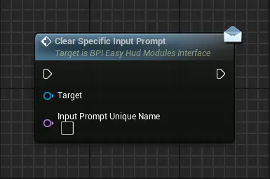
Input Prompt Unique NameUnique Name of an input prompt created in this module
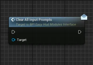
Clear All Input Prompts
Clear all the input prompts in the module
Items Pickup Displayer
Items Pickup Displayer
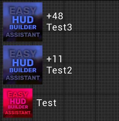
This module allow to display items pickup notifications of various size, shapes and content
Functions:
Display New Item Pick Up
This function handle all the logic to display an item pickup notification, calling this function again on the same module will create a queue to display all the needed notification. By default, up to 5 notification can be displayed at the same time, that value can be changed inside the module widget (WBP_EHB_ItemsPickupDisplayer)
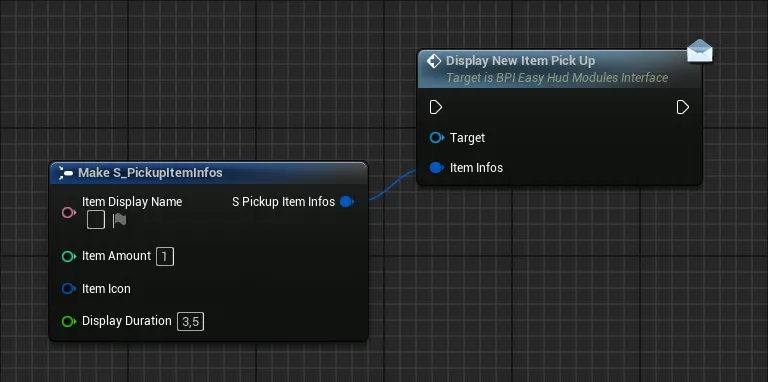
Item Display NameName of the item being picked upItem AmountAmount gained with that pick up, if the amount is 1 or lower, the amount won’t be displayed at all. If it’s greater than 1, the amount will be displayed above the display nameItem IconIcon of the item, should be square for the best results, you can apply any style you wish to itDisplay DurationDuration of the notification before being cleared
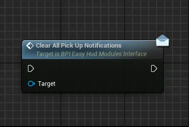
Clear All Pick Up Notifications
Clear all the currently displayed notifications and the notification queue if there are any elements left in it
Player Health Status
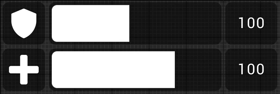
Player Health Status
This module allow to display an health bar and a shield bar based on needs
Functions:
Display Health Bar
Initialize the health bar with a visibility toggle and the current/maximum values to be displayed
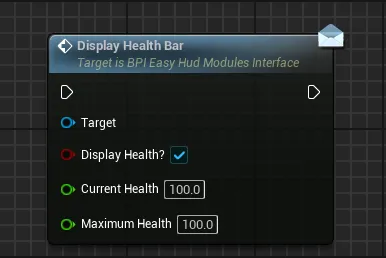
Display Health?If true, the health bar will be displayedCurrent HealthCurrent health value to be displayed by the number and the health barMaximum HealthMaximum health used to define how the health bar is displayed
Display Shield Bar
Initialize the shield bar with a visibility toggle and the current/maximum values to be displayed
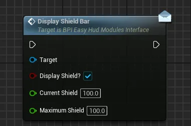
Display Shield?If true, the shield bar will be displayedCurrent ShieldCurrent shield value to be displayed by the number and the shield barMaximum ShieldMaximum shield used to define how the shield bar is displayed
Update Health Amount
Update the displayed health amount and the max health amount if needed
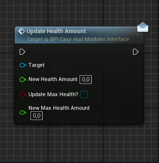
New Health AmountUpdated current health value to be displayedUpdate Max Health?If True, the max health will also be udpated with the specified valueNew Max Health AmountUpdated max health value to be displayed if an update is requested
Update Shield Amount
Update the displayed shield amount and the max shield amount if needed
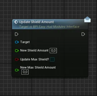
New Shield AmountUpdated current shield value to be displayedUpdate Max Shield?If True, the max shield will also be udpated with the specified valueNew Max Shield AmountUpdated max shield value to be displayed if an update is requested
Quest Status Displayer
Quest Status Displayer
This module allow to display a quest with multiple objectives that can be updated based on the current progress of any quest
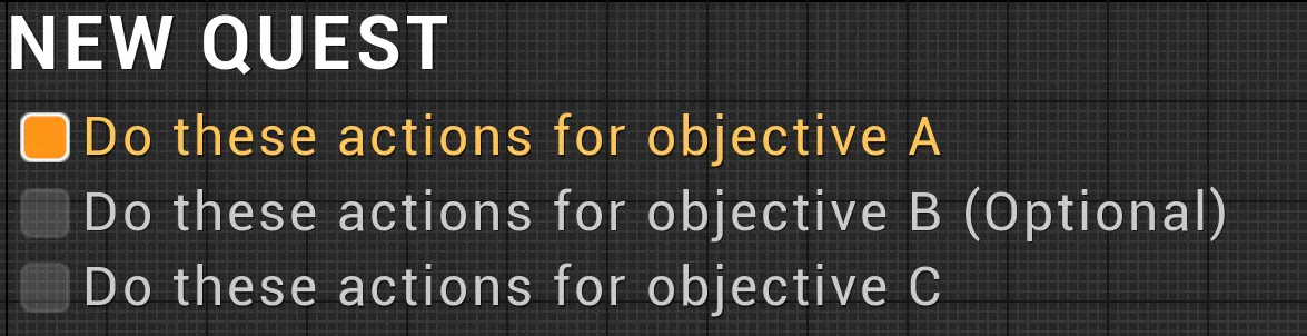
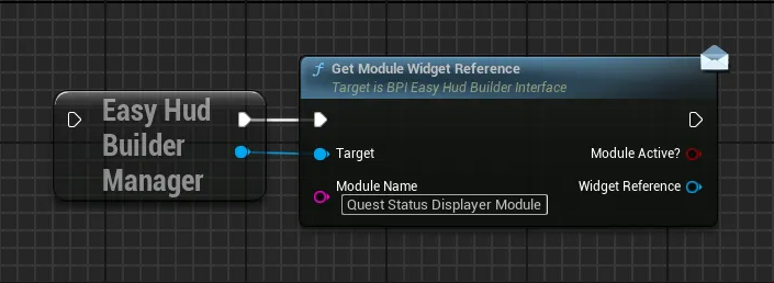
Functions:
Display New Quest
Initialize a new quest with an associated name and an initial set of objectives
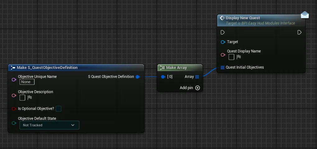
-
Quest Display NameDisplay name of the quest, shown above all objectives -
Quest Initial ObjectivesList of objectives to display, each has several parameters (those parameters can be changed after with the other functions)Objective Unique NameUnique Name for the objective, this name is used on other functions to update this specific objectiveObjective DescriptionText shown to describe the objectiveIs Optional Objective?If True, an additional text will tell the user that this objective is optional-
Objective Default StateDefault state that the objective will display, from 4 different states:Not TrackedShown as a default color for an objective that isn’t currently tracked

TrackedShown with an orange highlight to indicate an objective that is being actively tracked

FailedShown with a red highlight to indicate a failed objective

SucceededShown with a green highlight to indicate an objective successfully completed

Update Quest Objectives List
Fully refresh the current objectives of the quest, either by only adding new objectives or by replacing current objectives entirely
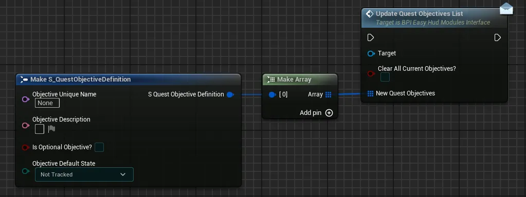
Clear All Current Objectives If True, all curent objectives will be removed before the new quest objectives are displayed, regardless of their state. If False, the new quest objectives will be displayed after those currently active objectives
New Quest Objectives List of new objectives to display, with the exact same parameters as for the initialization function “Display New Quest”
Update Quest Objective State
Update the state of a single objective in the quest, with the possibility to clear it after duration (if completed for example)
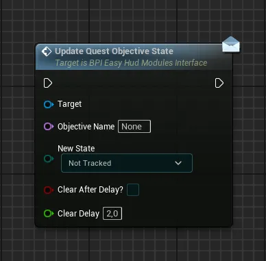
Objective Unique NameUnique Name of the objective that need to be updatedObjective Default StateNew state that the objective will display, from the 4 different states:Not Tracked/Tracked/Failed/SucceededClear After Delay?If True, the objective will updated its state and then be cleared after the specified delayClear DelayDelay after which the objective will be cleared if needed
Update Quest Objective Description
Update the description text of a single objective in the quest
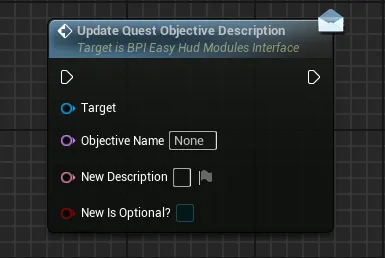
Objective Unique NameUnique Name of the objective that need to be updatedNew DescriptionNew description of the objectiveNew Is Optional?New optional state of the objective, if True, the objective will be marked as optional, if False, the optional tag will be removed from the objective
Clear Current Quest Objectives
Clear the currently defined quest objectives
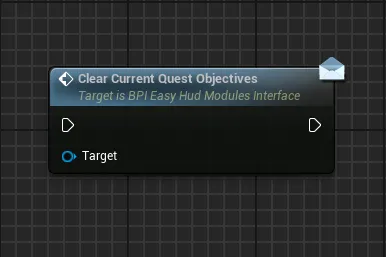
Clear Current Quest
Clear the current quest after a delay, with the possibility to prevent the clear if all objectives haven’t been completed
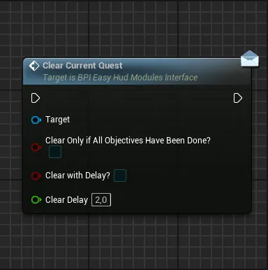
Clear Only If All Objectives Have Been Done?If True, the clear will be ignored in case any objective of the quest is not marked as Failed/Completed or has not been manually cleared. If False, the quest will get cleared regardless of the state of its objectivesClear With DelayIf True, the quest will not be cleared immediately but will instead be cleared at the end of the specified delay Note: Even if the clear is delayed, the check for objectives completion, defined by the previous setting, is done when the function is calledClear DelayDuration of the delay before clearing the quest if needed
Skill Consumable Displayer
Skill Consumable Displayer
This module allow to display a skill or consumable that can be used by the player
The default layout uses three different modules to display one ability and two consumable slots, you can change that to your likings and needs
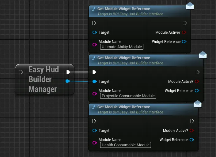
Functions:
Initialize Skill Slot
Initialize the state of a skill or item slot that has consumables (like projectiles, heal items, etc)
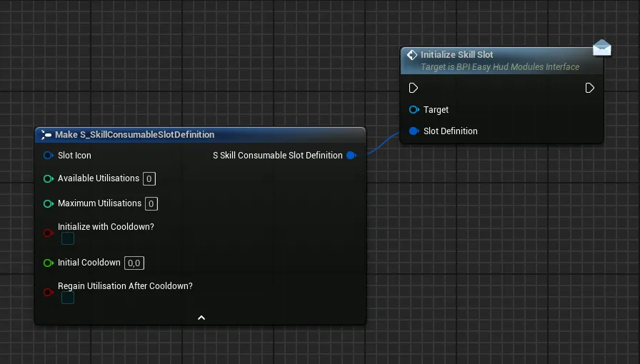
Slot IconImage representing the skill/item in the UI, the texture should be square for the best resultsAvailable UtilisationsDefine how many utilisations are currently available for this this skill/itemMaximum UtilisationsThe maximum number of times the skill/item can be stacked, needed when automatically regaining utilisations over timeInitialize with Cooldown?If true, the slot starts with a cooldown, useful for abilities that must charge up before their first useInitial CooldownDuration in seconds of the regeneration cooldown if neededRegain Utilisation After Cooldown?If true, the skill will automatically regain 1 utilisation after each cooldown cycle (defined by the initial cooldown)
Update Skill Slot Current Utilisation
Update the current utilisation count of a skill/item during gameplay and allow to trigger cooldowns if needed
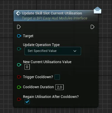
Update Operation TypeDefine how the new specified current utilisation value is redefined compared to its current valueSet Specified ValueOverwrite the current utilisation value with the specified valueAdd Specified Value To CurrentAdd the specified value to the current utilisation valueRemove Specified Value From CurrentRemove the specified value from the current utilisation value (the final value will never be negative)
New Current Utilisations ValueThe specified value to consider while doing the operationTrigger Cooldown?If true, a visual cooldown of the specified duration will start after the value updateCooldown DurationThe duration of the cooldown (in seconds) if requestedRegain Utilisation After Cooldown?If true, one utilisation will be restored when the cooldown ends, this will loop until the max utilisation of the slot is reached
Update Skill Slot Max Utilisation
Update the maximum utilisation count of a skill/item slot
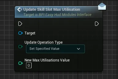
Update Operation TypeDefine how the new specified max utilisation value is redefined compared to its current max valueSet Specified ValueOverwrite the current max utilisation value with the specified valueAdd Specified Value To CurrentAdd the specified value to the current max utilisation valueRemove Specified Value From CurrentRemove the specified value from the current max utilisation value (the final value will never be negative)
New Max Utilisations ValueThe specified value to consider while doing the operation
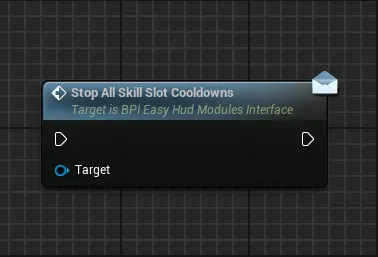
Stop All Skill Slot Cooldowns
Stop any cooldown that is active on the slot
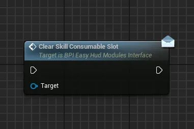
Clear Skill Consumable Slot
Clear the slot and hide it, any attached input prompt is also cleared
Display New Single Input Prompt
If you wish you can also call the function Display New Single Input Prompt to show an optionnal input prompt right below the skill/item slot. It can be useful to show which input may trigger the skill/item in the slot
The function and parameters are the same as for the Input Prompts Container module: Display New Single Input Prompt
Clear All Input Prompts
Clear any input prompt attached to the slot
Tutorial Pop Up
Tutorial Pop Up
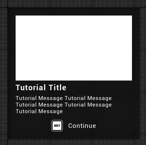
This module allow to display a tutorial pop up, can be used as a side pop up or fullscreen pop up
The default layout uses two different modules to display fullscreen tutorials and side tutorials, since tutorials don’t need to be displayed often, they are not included in any contexts but can be added manually based on needs with the following functions
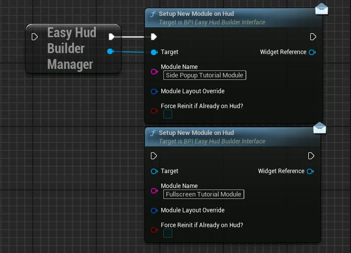
Functions:
Display New Tutorial
This function handle all the logic to display tutorials, calling this function again on the same module will create a queue to display all the needed tutorials one at a time (either controlled by duration or manual inputs)
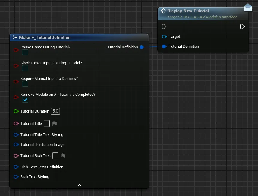
Pause Game During Tutorial?If True, the game will be paused while the tutorial is active. Note that if the game is paused, the manual input will always be requiredBlock Player Inputs During Tutorial?If True, all player inputs will be disabled while the tutorial is activeRequire Manual Input to Dismiss?If True, the tutorial will only disappear after the player hold the continue button for some time, required if pausing the gameRemove Module on All Tutorials Completed?If True, the system will automatically remove the entire tutorial module after all the tutorials in queue are completed. This means that the module will need to be added again on Hud to display new tutorials (However, the reference of the widget will remain the same)Tutorial DurationDefine how long (in seconds) the tutorial should stay on screen (if not requiring manual dismissal)Tutorial TitleThe title text of the tutorial popupTutorial Title Text StylingStyling information of the title text (size, font weight, alignment, etc)Tutorial Illustration ImageOptional image used to visually support the tutorial text, should be at a 16:9 format-
Tutorial Rich TextThe main tutorial text explaining the mechanic, UI, etc.This rich text has built in support to display inputs, to do so simply add a corresponding
{index}inside your text:{0}will display the first key,{1}will display the second key and so on (based on the keys defined by theRich Text Keys Definitionvariable). You can obviously write a simple text without any inputs to display -
Rich Text Keys DefinitionSet of variables defining which optionnal keys need to be displayed (expand for more)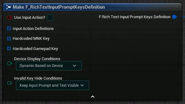
Use Input Action?If you want to use an input action to display an input, tick this checkbox. Leave it unticked if you want to hard-code the keys-
Input Action DefinitionsArray of input actions definition containing one input action, its corresponding input mapping context (in which we will search the requested key) as well as the index of that key if there are multiple keys for that action. This setup is pretty much the same as for the input prompts container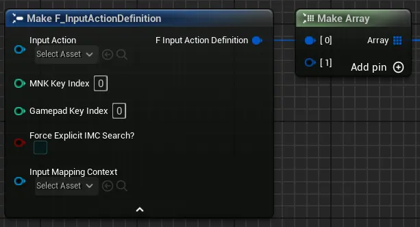
-
Hardcoded MNK Key&Hardcoded Gamepad KeyIf you did not tick the previous checkbox, you can now enter the hard-coded keys that you want to display inside the two arrays.You don’t need to enter both set of keys. You can just enter one of the two if you want to display keys for a single device
-
Device Display ConditionsThis variable has three options that control the display of the keys:Dynamic Based on Devicewill allow the input prompt to display both gamepad and mnk keys based of the device usedOnly Mouse & Keyboard Keyswill only allow mnk keys to be displayed, regardless of the device usedOnly Gamepad Keyswill only allow gamepad keys to be displayed, regardless of the device used
-
Invalid Key Hide ConditionsThis variable control how the input prompt should react if a key is invalid (either not the correct device, or key not found, etc.)Keep Input Prompt and Text VisibleThe Input Prompt and Text will stay visible when using another device or if the key is invalidHide Input Prompt OnlyThe Input Prompt will be hidden but the Text may still be visible when using another device or if the key is invalidHide Input Prompt and TextThe Input Prompt and Text will be hidden when using another device or if the key is invalid
For example: If you set the input prompt to display only Gamepad Keys, setting this variable as "Hide Input Prompt Only" allows you to hide the input when the player uses a keyboard instead of gamepad
-
Rich Text StylingSet of variables defining the styling of the rich text (expand for more)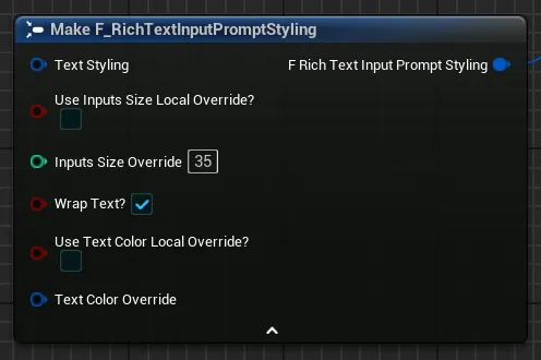
Text StylingSet of options to control the text font, transform policy and justificationUse Inputs Size Local Override?If True, the inputs will use the defined size override instead of the text font sizeInput Size OverrideThis setting define the size of the displayed input prompt icon in pixels (if overriding)Wrap Text?If True, the text will be allowed to wrap in its container if neededUse Text Color Local Override?If True, the text will use the defined text colorText Color OverrideText color to use if overriding the default color
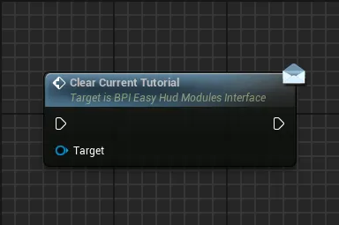
Clear Current Tutorial
Clear the currently active tutorial and start displaying the next tutorial in queue if there are any
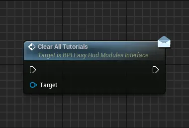
Clear All Tutorials
Clear any currently active tutorials and tutorials in queue
Important Alerts Displayer
Important Alerts Displayer
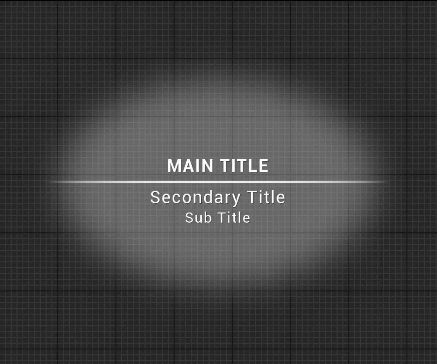
This module allow to display any important alert to the player, new area discovered, new gear unlocked, etc
Functions:
Display New Important Alert
This function handle all the logic to display important alerts, calling this function again on the same module will create a queue to display all the needed alerts one at a time based on their priority
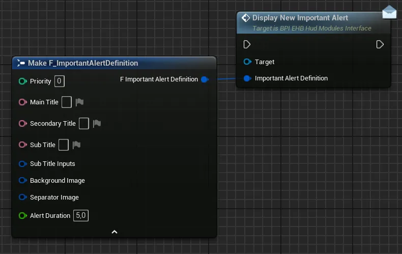
PriorityDefine how important this alert is in queue, higher priority alerts will be placed as first in queue and be played right after the current alert is completed. If priority is the same on multiple alerts, then the oldest will be first and the newly added alert will be the last of that priority groupMain TitleMain Title of the alertSecondary TitleSecondary title of the alert-
Sub TitleAny third text you may wish to display under the secondary titleThis sub title text has built in support to display inputs, to do so simply add a corresponding
{index}inside your text:{0}will display the first key,{1}will display the second key and so on (based on the keys defined by theSub title Inputsvariable). You can obviously write a simple text without any inputs to display -
Sub title InputsSet of variables defining which optionnal keys need to be displayed (expand for more)Use Input Action?If you want to use an input action to display an input, tick this checkbox. Leave it unticked if you want to hard-code the keys-
Input Action DefinitionsArray of input actions definition containing one input action, its corresponding input mapping context (in which we will search the requested key) as well as the index of that key if there are multiple keys for that action. This setup is pretty much the same as for the input prompts container -
Hardcoded MNK Key&Hardcoded Gamepad KeyIf you did not tick the previous checkbox, you can now enter the hard-coded keys that you want to display inside the two arrays.You don’t need to enter both set of keys. You can just enter one of the two if you want to display keys for a single device
-
Device Display ConditionsThis variable has three options that control the display of the keys:Dynamic Based on Devicewill allow the input prompt to display both gamepad and mnk keys based of the device usedOnly Mouse & Keyboard Keyswill only allow mnk keys to be displayed, regardless of the device usedOnly Gamepad Keyswill only allow gamepad keys to be displayed, regardless of the device used
-
Invalid Key Hide ConditionsThis variable control how the input prompt should react if a key is invalid (either not the correct device, or key not found, etc.)Keep Input Prompt and Text VisibleThe Input Prompt and Text will stay visible when using another device or if the key is invalidHide Input Prompt OnlyThe Input Prompt will be hidden but the Text may still be visible when using another device or if the key is invalidHide Input Prompt and TextThe Input Prompt and Text will be hidden when using another device or if the key is invalid
For example: If you set the input prompt to display only Gamepad Keys, setting this variable as "Hide Input Prompt Only" allows you to hide the input when the player uses a keyboard instead of gamepad
-
Background ImageImage to display on the background of the texts Separator ImageImage to display as a separator between the Main Title and Secondary TitlesAlert DurationDuration of the alert notification before fading out
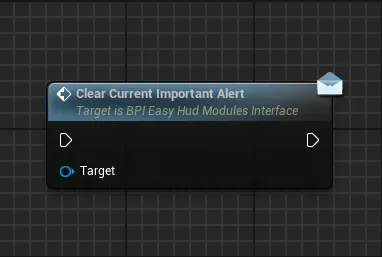
Clear Current Important Alert
Immediately clear the current important alert and start displaying the next alert in queue if there are any
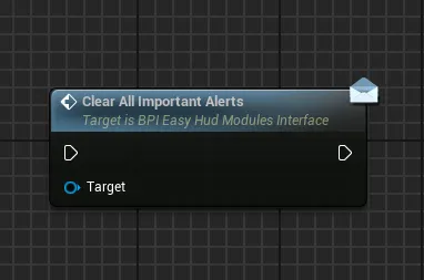
Clear All Important Alerts
Clear the current important alert and all the alerts that may be in queue
Framerate Counter
Framerate Counter
This module allow to display a simple framerate counter
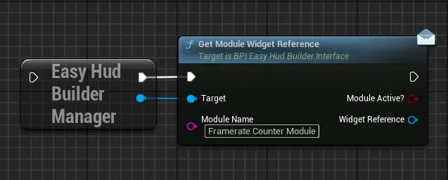
Functions:
Display Framerate Counter
Start to display the framerate counter with the requested refresh interval
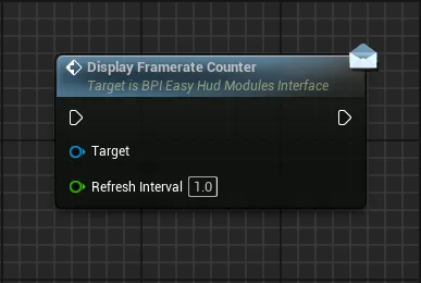
Refresh IntervalInterval in seconds between each refresh of the counter
Clear Framerate Counter
Stop and hide the framerate counter