Modular Widgets System
All the widgets included in the pack use “Common Widgets” built to be reusable, easy to integrate and modify. These widgets can be found under EasyGameUI/Core/CommonWidgets and can be used to build any of your own widgets
Feel free to tweak all of these widgets if you want to change the layout or anything else! The styling of those widgets is controlled with the Global Styling system
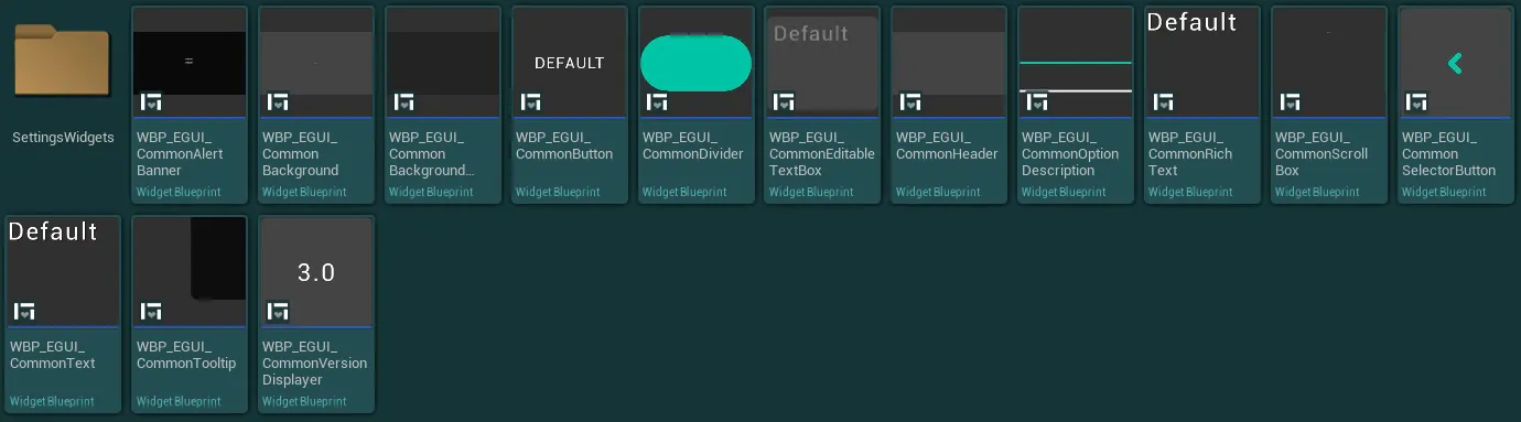
The guides below cover the base setup and various tips to use those widgets in your systems
Settings Widgets
Settings Widgets
The settings widgets folder contains various widgets that are used as part of the setting system, you can find how to use that system and those widgets in the Settings System documentation section
Alert Banner
Alert Banner
This widget can be used to display an alert to the user with multiple possible actions (to confirm some action for example)
The alert banner can be triggered from the HUD by calling the function Setup Alert Banner like on the following example:
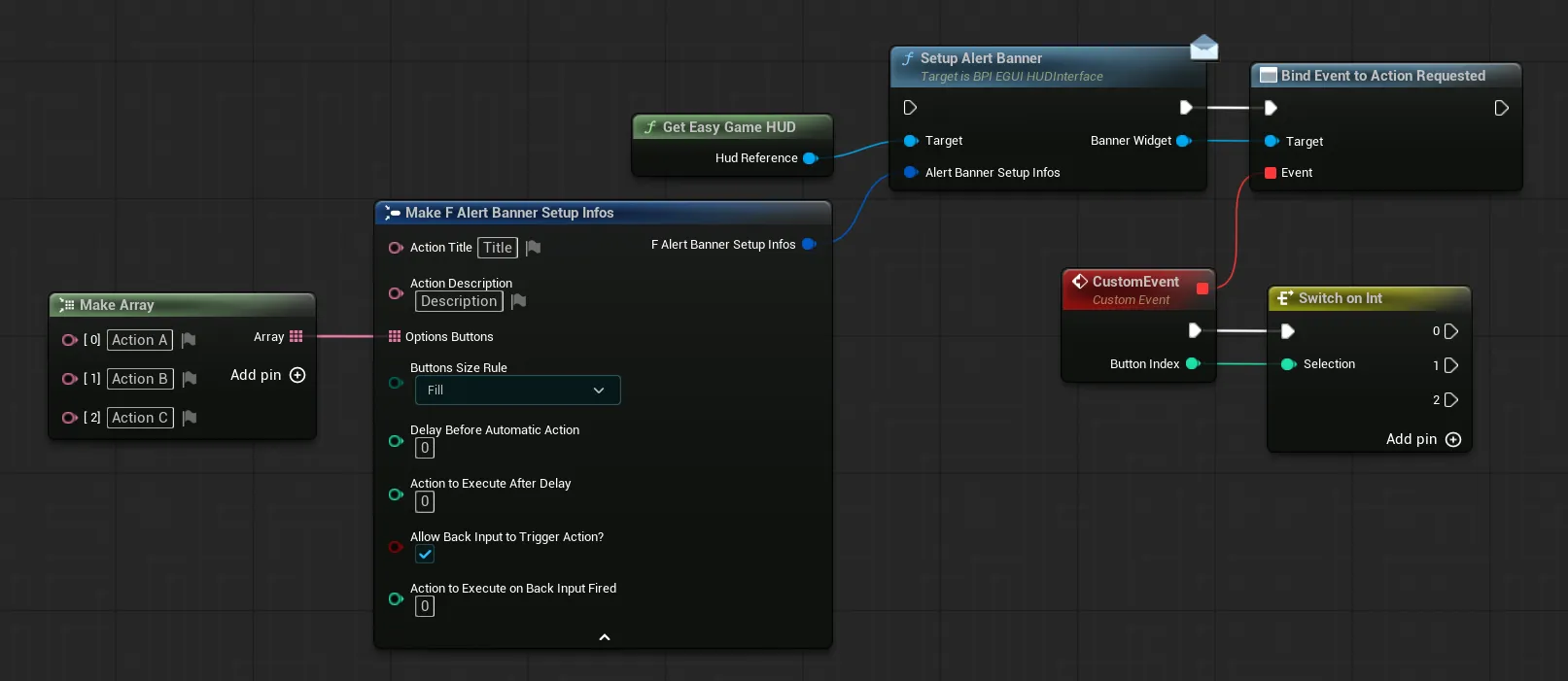
The Alert Banner Setup Infos pin allows you the configure the alert banner with the following variables
Action Title/Action DescriptionTitle and Description of the action that need confirmation from the playerOptions ButtonsArray of all the actions possible by the playerButtons Size RuleDefine the size of the buttons
FillAll buttons have the same size but text can clip if it is too longAutomaticText won't clip but the buttons will have different sizesDelay Before Automatic ActionDelay in seconds before an action is automatically selected for the player (0 = indefinite)Action To Execute After DelayIndex of the action (from the Options Buttons list) to execute after the delay is expired (if delay > 0)Allow Back Input To Trigger Action?If true, the player can press the "Back" input (Escape / Gamepad Face Button Right by default) to trigger an action, can be useful for a "Cancel" actionAction To Execute On Back Input FiredIndex of the action to execute when the "Back" input is pressed by the player (if allowed)
To execute logic based on the selected button, you can bind an event to the Action Requested Dispatcher and use the button index pin to know which action was requested (index based on the options button list)
You can find a full alert banner setup example in the WBP_EasyExampleWidget widget located in the folder EasyGameUI/DemoContent
Background
Background
This widget can be used as a simple background and container for other ui elements
-
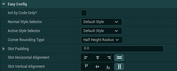
Init by Code Only?If True, the styling of the background won't initialize automatically, you will need to call theInit Stylingfunction on the backgroundThis can be useful if wish to modify the styling variable at runtime
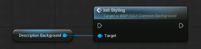
-
Normal Style Selector/Active Style SelectorStyle used by the background from all the styles defined inside the Global StylingThe
Active Style Selectorwill only be used when calling the functionSet Background Activeon the background widget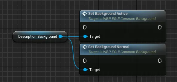
-
Corner Rounding TypeRounding type of the background corners between fixed and half height. If fixed, the values used can be controlled in the global styling -
Slot Padding/Slot AlignmentInternal padding and alignement of the content inside the panel relative to the background
Background Image
Background Image
This widget can be used to quickly setup a background image behind your widget content
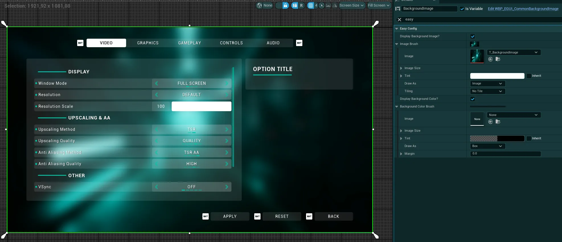
From the widget config you can control the display of the image and/or background color as well as the desired brush for the image and background
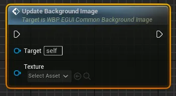
You can also change the background image from blueprints with the Update Background Image function
Button
Button
This widget can be used for anything that requires a button to trigger an action with built-in support for proper ui navigation. You can configure many variables on each button:
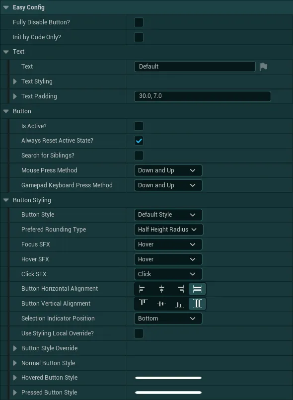
Fully Disable ButtonIf True, the button will be disabled and hidden from view, this can be useful to quickly disable/enable buttons. You can also use the functionRequest Button Visibilityto update the visibility of the button while considering this disable button variable (to only update the visibility if the button is not disabled)Init By Code Only?If True, the button won't initialize automatically, you will need to call theInit Buttonfunction to initalize the styling of the widget. If False, the style will be set as soon as the widget is created
The Text category contain all the styling and configuration about the text displayed by the button such as the justification, transform policy, padding and font
The Button category contain various variables controlling the button behavior
Is Active?If the button is active or not by default (useful for tabs for example), the button will be set as Active whenever it is clickedAlways Reset Active State?If True, the button will always revert to anIs Active?= False state after clicked which reset the style and allow the user to click again on the button-
Search For Siblings?If True, the button will search for any other buttons in the same container in order to affect their active state and allow only a single button per-container to be active.If False, this search will be skipped and the button won’t affect any other buttons, this also allows to save some performances.
-
Mouse Press Method/Gamepad Press MethodMethod required to trigger the button when using a mouse or gamepad
The Button Styling category contain various variables controlling the button style
Button StyleDefines which style of the Global Styling should be used by the buttonPrefered Rounding TypeIf the button should have a half height radius or fixed radius. When the global rounding type is defined as fixed, this variable is ignoredFocus SFX/Hover SFX/Click SFXSound effects triggered by the button when hovered, focused, and clicked. Based on the UI SFX defined in the Global StylingButton Horizontal Alignment/Button Vertical AlignmentThe alignement relative to its parent-
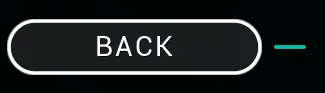
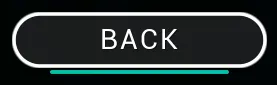
Selection Indicator PositionControl the position of the indicator used to show if the button is hovered or focusedRight placement
Bottom Placement
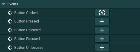
You also have access to various events from the button:
Header
Header
This widget can be used as a header to quickly switch between multiple tabs such as with a widget switcher
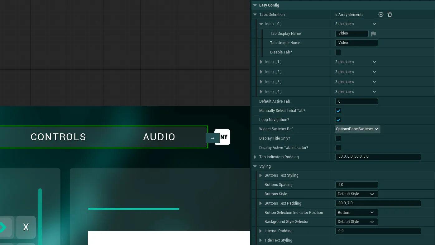
Tabs DefinitionThis array defines the list of tabs to display, each tab is defined by a localizable display name, a static unique name (can be used for identification in code) and a simple boolean that allows you to display the specific tab if neededDefault Active TabDefines the tab that will be activated by default (based on the tabs list)-
Manually Select Initial Tab?If True, theDefault Active Tabwill be ignored and you will then need to call theSelect Initial Tabfunction from the header in order to set which tab will be selected at first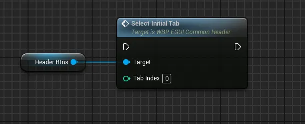
-
Loop NavigationIf True, the navigation will loop when going previous/next with the functionGo To Previous Or Next Tab Widget Switcher RefOptional reference to a widget switcher that can be controlled by the header (The switcher index will automatically be controlled by the header when liked)-
Display Title OnlyIf True, all the buttons will be hidden and only the active button title will be displayed. This can be useful for more compact UIsNote
If True, you will need to provide a different way of switching the tabs, such as buttons to select the next and previous tab using the
Go to Previous or Next Tabfunction from the header widget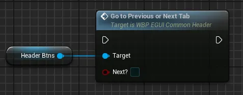
-
Display Active Tab Indicator?If only displaying the title, setting this to True will display an active tab indicator under the title - Variables under
Stylingdefine the global style of the header, buttons, texts, etc. All based on global styling variables like described in the Button or Text widgets
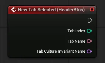
The widget also has an event New Tab Selected that is triggered whenever a tab is selected and provides the index of the selected tab as well as its display name and unique name (culture invariant name)

Text
Text
This widget can be used as a simple text anywhere needed to have easy global styling
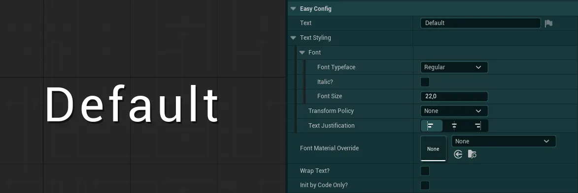
In the config of this widget you can setup the text as well as its various styling settings
TextSimple field to define the displayed textText StylingFont, transform policy and justification used by the text, based on the Global Styling parametersFont Material OverrideAllows you to define a font material that will be used by the textWrap Text?If True, allows the text to wrap when neededInit by Code Only?If True, the text input and text styling values will be ignored on construction and you can initialize the text using theUpdate Font InfosorUpdate Text Stylingfunctions
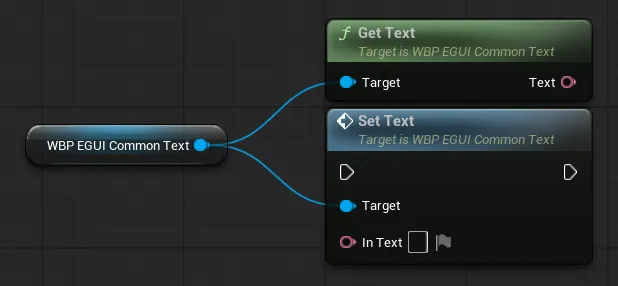
You can also use the Get Text / Set Text functions to get or update the text displayed by the widget
Rich Text
Rich Text
This widget can be used as a rich text anywhere needed to have easy global styling and setup for rich texts. You can learn more about rich texts in the Unreal Documentation
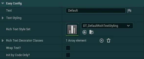
In the config of this widget you can setup the text as well as its various styling settings
TextSimple field to define the displayed textText StylingFont, transform policy and justification used by the text by default, based on the Global Styling parametersRich Text Style Setdefine which font settings can be used to style the textRich Text Decorator Classesdefine which additional “decorations” can be added to the text such as icons, images, etc. By default the rich text has a decorator that allow to display input icons. You can also check out the Input Prompt System for input rich texts.Init by Code Only?If True, the text input and text styling values will be ignored and you can initialize the text using theUpdate Font InfosorUpdate Text Stylingfunctions
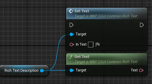
You can also use the Get Text / Set Text functions to get or update the text displayed by the widget
Editable Text Box
Editable Text Box
This widget can be used as a text input for the player
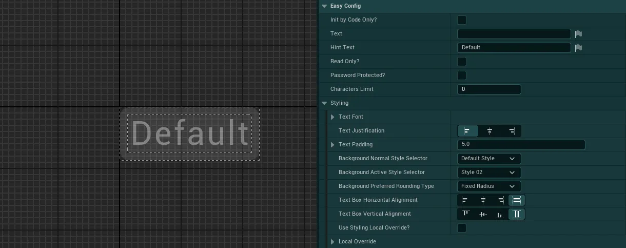
In this widget config you can tweak several variables related to the inputs of the editable text box as well as its styling.
-
Init by Code Only?If True, the text, hint text and text font values will be ignored and you can initialize the text using theUpdate Font Infosfunction when needed: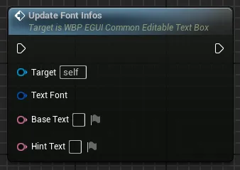
-
TextDefines any text that should be written in the field by default Hint TextDefines any text that should be there only as “overlay” that will get cleared once the user interact with the text boxRead Only?If True, the user will only be able to read the text input without being able to typePassword ProtectedIf True, the typed text will be obfuscated as a password field-
Charaters LimitMaximum number of characters allowed by the text field (0 = infinite) -
Under the
Stylingcategory, you can tweak the styling of the text box by changing the background, alignment, font etc -
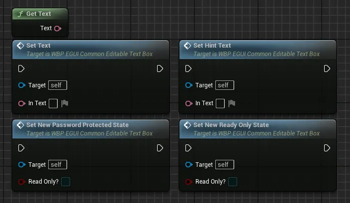
Several functions and events are also available to receive data from the text box and update it

Scroll Box
Scroll Box
This widget can be used as a basic scrollbox for any long content that requires scrolling
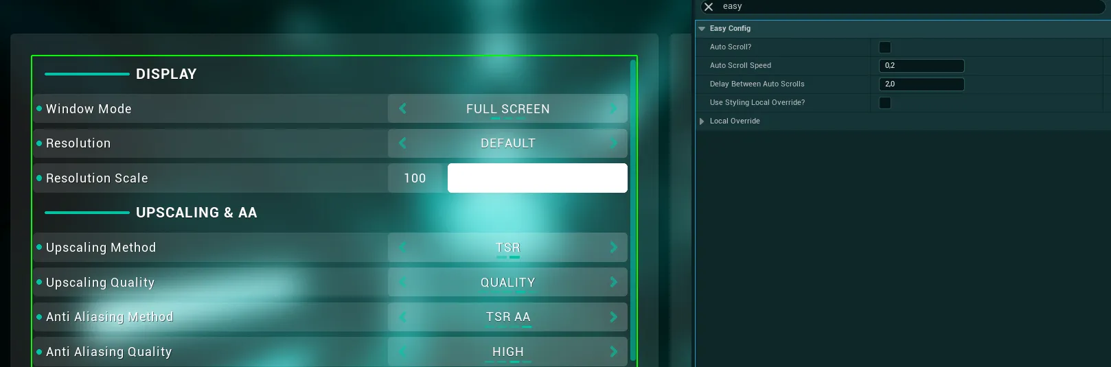
The scrollbox comes with an auto scroll feature which can be useful for some content such as long texts
-
Auto Scroll?If True, the auto scroll feature will be enabled on this scrollbox -
Auto Scroll SpeedSpeed of the auto scrolling, this is a percentage of how much the scrollbox will be scrolled each tick so 0.2 means 2% of its total height per tick -
Delay Between Auto ScrollsDefines how long until the scrollbox will scroll in the other direction when it arrived to the end or begining
Tooltip
Tooltip
This widget can be used as a simple tooltip to provide more informations to the player before doing an action

The tooltip can be triggered from the HUD by calling the function Setup Widget Tooltip like on the following example:
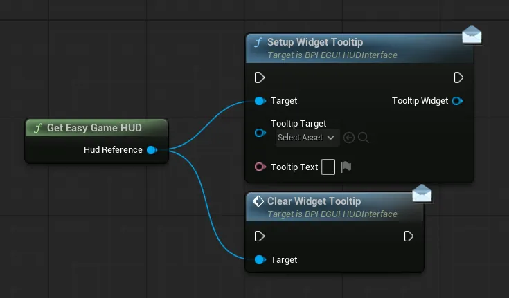
The Tooltip Target is the widget that will show the tooltip when hovered (like a button) and Tooltip Text defines what will be displayed by the tooltip
Option Description
Option Description
This widget can be used to display a set of title/description/image to give more details on some parts of the ui such as for settings description or save file preview.
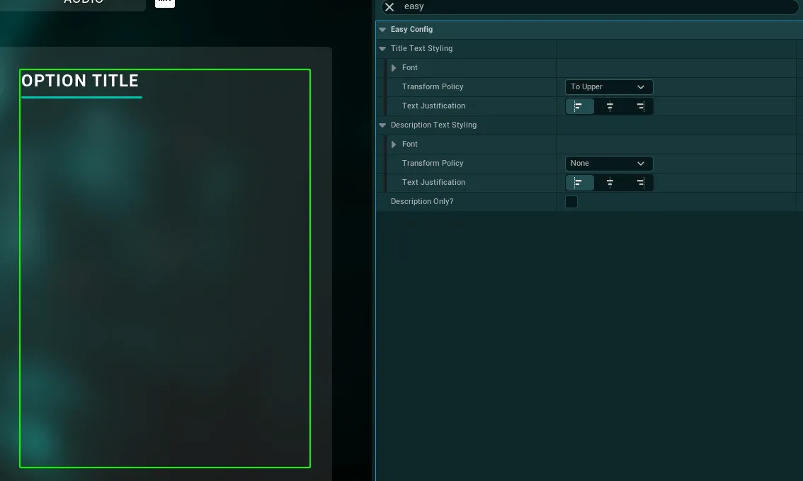
In the config of this widget, you can control the font, transform policy and justification used by the title and the description texts. You can hide the title as well if you want to display only the description part of the widget.
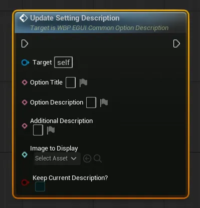
You can also update the displayed description from code with the
Update Setting Descriptionfunction
- The 3 firsts variables are for the displayed text
- The
Image to Displayvariable can be filled with any texture, it should ideally be in a 16:9 ratioKeep Current Description?If true the description currently displayed will be kept and shown below the new one being defined
Selector Button
Selector Button
This widget can be used as a simple "Previous/Next" selection actions like on settings or photo gallery. The arrow texture is defined through the Global Styling

In this widget config you can tweak several settings relative to the look of the selector button
Image SizeThe size in pixels of the arrow imageSelector Rotation AngleThe angle where the arrow should be pointing by defaultImage PaddingAny additional padding that needs to be added around the imageButton StyleWhich style defined in the Global Styling should be used by the underlying buttonSelection Indicator PositionSame as for the Button, allow to control the position of the small bar that is used to indicate if the button is hovered or focusedPrefered Rounding TypeIf the button should have a half height radius or fixed radius. This is ignored when using global rounding parameters from the Global Styling
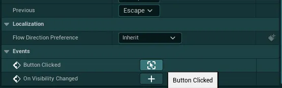
You can then use the Button Clicked event to do any action
Version Displayer
Version Displayer
This widget can be used to display the current game version if enabled inside the Global Config
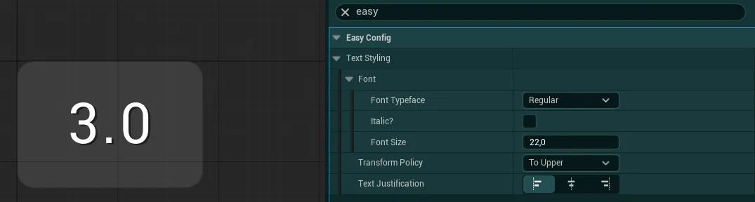
In this widget config you can control the text styling, everything else is automatically set based on informations from the Global Config & Styling