Input Prompts System
The built-in Input Prompts system allows to easily display inputs icons to guide the player on available keybinds. These input prompts are used in most UIs across the pack, in the following guides you can find how to use them accross your own systems:
Single Input Prompt Widget
The base Input Prompt Widget allow to display a single input prompt of your choice in any widget, either with hard coded keys or dynamicly from an Input Action
- In your project, open the widget in which you want to display your simple input prompt
-
Search for the
Easy Input Promptscategory in the Palette tab then drag & drop theWBP Easy Input Prompt Displayerwidget under any container of your choice (canvas panel, horizontal box, button, etc.)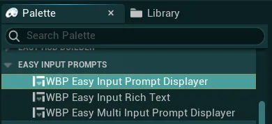
-
Once added, you will see many variables available to you in the Details panel, under the
Easy Configcategory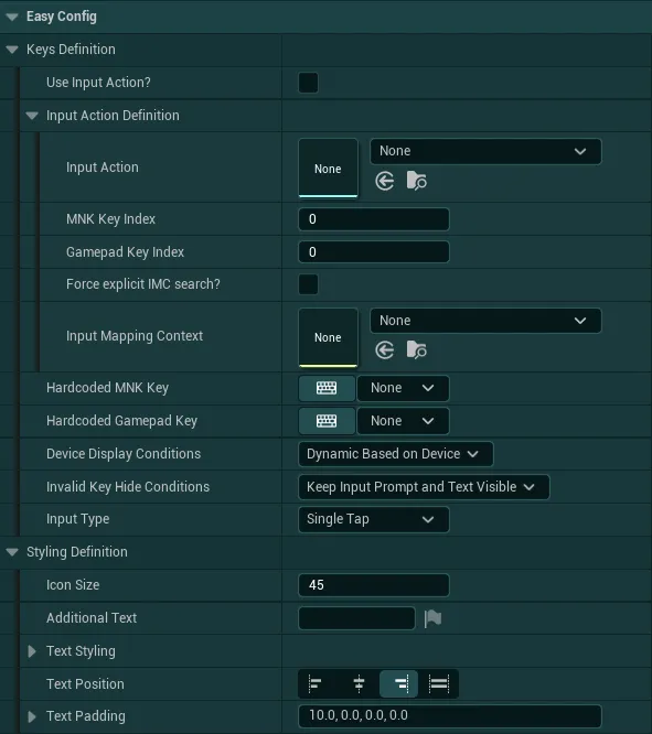
Keys Definitionallow to control which keys need to be displayed by the widgetUse Input Action?If you want to use an input action to display an input, tick this checkbox. Leave it unticked if you want to hard-code the keys-
Input Action DefinitionIf you ticked the previous checkbox, you now need to fill in the details about the input action that you want to displaySelect the Input Action in the dropdown and the Input Mapping Context from which you want to gather the keybinds
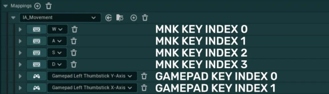
If the selected Input Action has more than 1 key per device in the mapping context, then you need to identify which key index you wish to display.
In the example below, there are 4 indexes for keyboard keys and 2 indexes for gamepad keys. If you want to display “D” and “Thumbstick X-Axis”, you need to enter the indexes 3 and 1 in the respective fields.
-
Hardcoded MNK Key&Hardcoded Gamepad KeyIf you did not tick the previous checkbox, you can now enter the hard-coded keys that you want to display using the two dropdowns and typing the name of the key
You don’t need to enter both keys. You can just enter one of the two if you want to display a key for a single device
-
Device Display ConditionsThis variable has three options that control the display of the keys:Dynamic Based on Devicewill allow the input prompt to display both gamepad and mnk keys based of the device usedOnly Mouse & Keyboard Keyswill only allow mnk keys to be displayed, regardless of the device usedOnly Gamepad Keyswill only allow gamepad keys to be displayed, regardless of the device used
-
Invalid Key Hide ConditionsThis variable control how the input prompt should react if a key is invalid (either not the correct device, or key not found, etc.)Keep Input Prompt and Text VisibleThe Input Prompt and Text will stay visible when using another device or if the key is invalidHide Input Prompt OnlyThe Input Prompt will be hidden but the Text may still be visible when using another device or if the key is invalidHide Input Prompt and TextThe Input Prompt and Text will be hidden when using another device or if the key is invalid
For example: If you set the input prompt to display only Gamepad Keys, setting this variable as "Hide Input Prompt Only" allows you to hide the input when the player uses a keyboard instead of gamepad
-
Input TypeThis variable allow to select which input type the key should display between three options: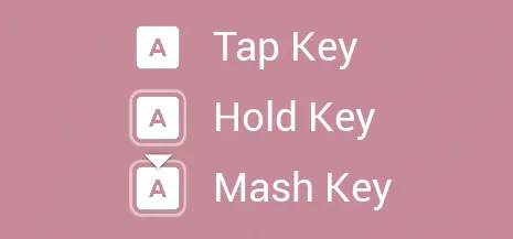
Single TapA basic single tap key for most use casesHoldA key that must be held for a specified amount of timeButton MashA key that must be repeatedly pressed for a specified amount of time
Styling Definitionallows you to control the size of the key, add an optional text near the key and change the overall styling of the input promptIcon SizeThis setting define the size of the displayed input prompt icon in pixelsAdditional TextOptional text to display near the key. You can leave it empty if no text needs to be displayedText StylingSet of options to control the text font, transform policy and justificationText PositionOption to control the position of the text relative to the key icon. Only the right alignment and left alignment can be selectedText PaddingOptional padding to add around the text
Multi Input Prompts Widget
The Multi Input Prompt Widget allow to display multiple inputs of your choice at the same time, but offers a bit less control over the styling and display of the said icons than with the simple Input Prompt Widget
- In your project, open the widget in which you want to display your multi input prompt
-
Search for the
Easy Input Promptscategory in the Palette tab then drag & drop theWBP Easy Multi Input Prompt Displayerwidget under any container of your choice (canvas panel, horizontal box, button, etc.)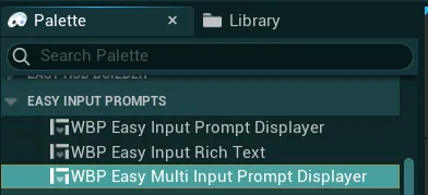
-
Once added, you will see many variables available to you in the Details panel, under the
Easy Configcategory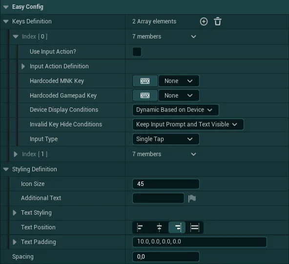
Keys Definitionis an array in which you can list all the keys you would like to display, for each key the configuration is identical as for the simple input prompt keys definitionStyling Definitionallows you to control the styling of all the displayed icons (they will share the same styling), the configuration is identical as for the simple input prompt styling definitionSpacingDefines the spacing between each displayed input icon
Rich Text Input Prompt
The Rich Text Input Prompt allow to have much more control over the text displayed but still allow for dynamic inputs to be displayed within the text. This can be useful for tutorials for example
- In your project, open the widget in which you want to display your multi input prompt
-
Search for the
Easy Input Promptscategory in the Palette tab then drag & drop theWBP Easy Input Rich Textwidget under any container of your choice (canvas panel, horizontal box, button, etc.)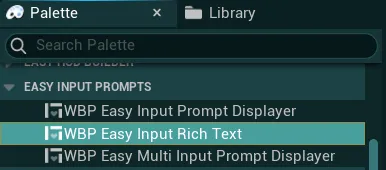
-
Once added, you will see many variables available to you in the Details panel, under the
Easy Configcategory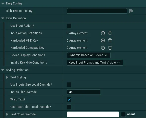
-
Rich Text to DisplayA basic rich text input, if you aren't familiar with the usage of rich texts, you can check out the following documentationThis rich text widget has a default styling that allow for various fonts as listed below. If you would like to edit those or add your own “modifiers”, you can do so in the
DT_DefaultRichTextStylingdata table.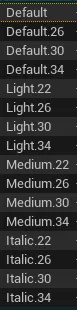
-
Keys Definitionallow to control which keys need to be displayed by the widget with several arrays. In these arrays you can define multiple input actions or keys, this will allow you to display multiple dynamic keys inside the rich text.For each key in those arrays, add a corresponding
{index}inside your text:{0}will display the first key,{1}will display the second key and so on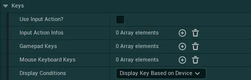
Here is a setup example:
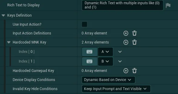

-
Rich Text StylingSet of variables defining the styling of the rich textText StylingSet of options to control the text font, transform policy and justificationUse Inputs Size Local Override?If True, the inputs will use the defined size override instead of the text font sizeInput Size OverrideThis setting define the size of the displayed input prompt icon in pixels (if overriding)Wrap Text?If True, the text will be allowed to wrap in its container if neededUse Text Color Local Override?If True, the text will use the defined text colorText Color OverrideText color to use if overriding the default color
-
World Input Prompt
The World Input Prompt allow to easily display input prompts directly in the 3D World. The system then uses a Multi Input Prompts widget to display the desired inputs
- To use it in your level, go to the
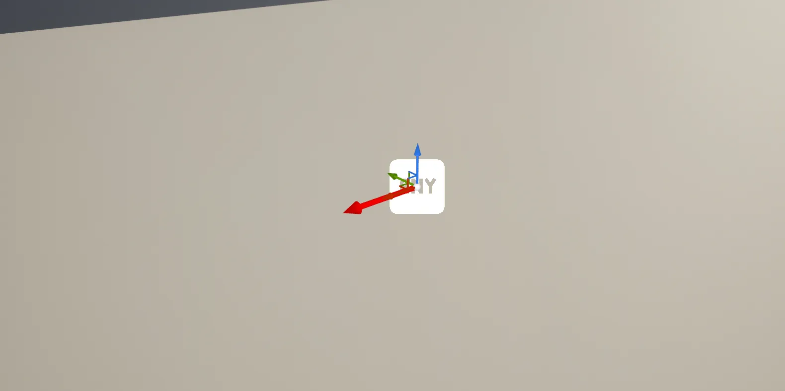
EasyGameUI/EasyInputPrompts/Corefolder and look for theBP_EasyWorldInputPrompt -
Drag & Drop it inside your level at the location where the 3D Input Prompt should be. The red arrow indicate from where the widget will be visible from
-
You then have access to all the settings inside the
Detailspanel, under theEasy Configcategory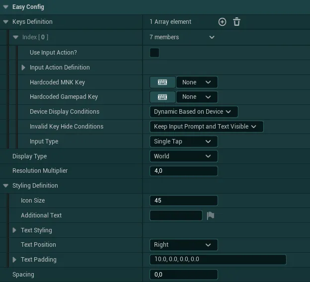
Keys Definitionis an array in which you can list all the keys you would like to display, for each key the configuration is identical as for the simple input prompt keys definition-
Display TypeDefines how the widget should be rendered betweenWorldandScreen-
WorldThe Widget act fully as a 3D World Object (with fixed position and rotation in the world as well as proper parallax when the player goes around the text)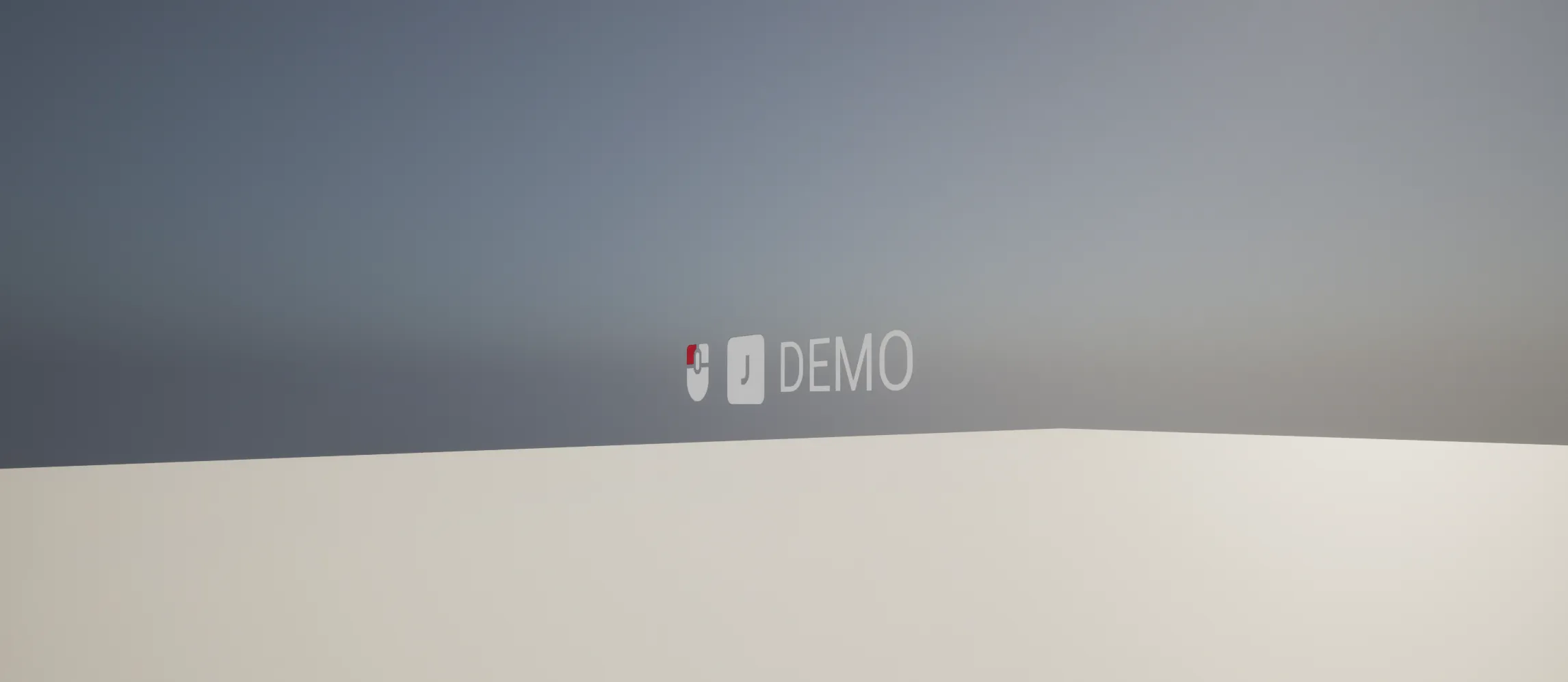
-
ScreenThe widget will try to retain a fixed size on screen relative to its location. It will also rotate on itself to stay on screen regardless of the angle of the camera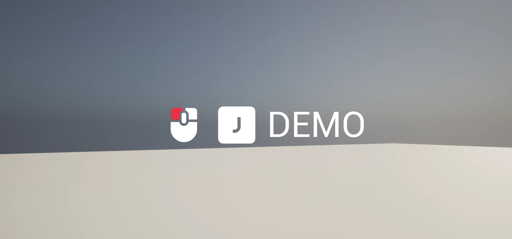
-
-
Resolution MultiplierDefine how much the widget should be upscaled. Higher values will lead to better quality but higher performance impact, this setting will higly depend on how close the player can be and how big the widget is Styling Definitionallows you to control the styling of all the displayed icons (they will share the same styling), the configuration is identical as for the simple input prompt styling definitionSpacingDefines the spacing between each displayed input icon